Brain size & scaling – virtual lab activity

Each year in my intro bio-anthro class, we start the course by asking how our brains contribute to making us humans such quirky animals. Our first lab assignment in the class uses 3D models of brain endocasts, to ask whether modern human and fossil hominin brains are merely primate brains scaled up to a larger size. In the Before Times, students downloaded 3D meshes that I had made, and study and measure them with the open-source software Meshlab. But since the pandemic has forced everyone onto their own personal computers, I made the activity all online, to minimize issues arising from unequal access to computing resources. And since it’s all online, I may as well make it available to everyone in case it’s useful for other people’s teaching.

The lab involves taking measurements on 3D models on Sketchfab using their handy measurement tool, and entering the data into a Google Sheets table, which then automatically creates graphs, examines the scaling relationship between brain size (endocranial volume, ECV) and endocast measurements, and makes predictions about humans and fossil hominins based off the primate scaling relationship. Here’s the quick walk-through:

Go to the “Data sources” tab in the Google Sheet, follow the link to the Sketchfab Measurement Tool, and copy the link to the endocast you want to study (3D models can only be accessed with the specific links).

Following the endocast Sketchfab link (column D) will bring you to a page with the 3D endocast, as well as some information about how the endocast was created and includes its overall brain size (ECV in cubic cm). Pasting the link when prompted in the Measurement Tool page will allow you to load, view, and take linear measurements on the endocast.

Hylobates lar endocast, measuring cerebral hemisphere length between the green and red dots.

Sketchfab makes it quite easy to take simple linear measurements, by simply clicking where you want to place the start and end points. The 3D models of the endocasts are all properly scaled, and so all measurements that appear in the window are in millimeters.

The assignment specifies three simple measurements for students to take on each endocast (length, width, and height). In addition, students get to propose a measurement for the size of the prefrontal cortex, since our accompanying reading (Schoenemann, 2006) explains that it is debated whether the human prefrontal is disproportionately enlarged. All measurements are then entered into the Google Sheet — I wanted students to manually enter the ECV for each endocast, to help them appreciate the overall brain size differences in this virtual dataset (size and scale are often lost when you have to look at everything on the same-sized 2D screen).

Feel free to use or adapt this assignment for your own classes. The assignment instructions can be found here, and the data recording sheet (with links to endocast 3D models) can be found here — these are Google documents that are visible, but you can save and edit them by either downloading them or making a copy to open in Docs or Sheets.

Ah, teaching in the pandemic 🙃

This is how we do it

It’s Friday night. Our description of the Homo naledi femora (thigh bones) from the Lesedi Chamber is hot off the press. This coincides with the publication of another study (with which I wasn’t involved) of the species’ proximal femur, so I guess you could say it’s a pretty hip time for Homo naledi fossils.

screenshot_116

An important task in our study was to estimate the diameter of the poorly preserved femur head (part of the hip joint), a variable which is useful for estimating body mass in extinct animals, which in turn is an important life history variable. One thing I’ve recently been griping about with my students is that while many general research methods are well published, the step-by-step processes usually are not. So, here I’ll detail exactly how we estimated femur head diameter (FHD) —it’s pretty simple, but it took a while to figure it out on my own. And now you won’t have to!

We used the simple yet brilliant approach that Ashley Hammond and colleagues (2013) developed for the acetabulum (the hip socket). In brief, if you have a 3D model or mesh of a bone, you can use various software packages to highlight an area and the software will find the best fit of a given shape to that surface. I used Amira/Avizo and Geomagic Design X, which are great but admittedly quite expensive.

1. Identify the preserved bony surface by making a curvature map
You can do this in Geomagic, but I figured it out in Amira first, so here we are. Also,  Amira gives you more control over the resulting colormap, which I think makes it easier to identify preserved vs. broken bone surfaces. The module-based workflow of Amira/Avizo takes some getting used to, but this step is quite simple, once you’ve imported the mesh (“UW 102a-001.stl” in the image below).

step 1

Amira workflow (left). The red “Curvature” module is applied to the surface mesh (“UW102a-001.stl”), resulting in a new object (“MaxCurvatureInv”), whose surface view is depicted at right.

The surface is now color-coded, with areas of high curvature (i.e., broken bone and exposed trabecular bone) in blue and better-preserved surfaces in red. This allows you to see which portion(s) of the bone to use to define the sphere.

Screen Shot 2019-06-26 at 10.55.28 AM

The curvature map reveals three large patches (A-C) of decently-preserved hip joint surface.

2. Highlight the desired surface in Geomagic
Import the 3D mesh into Geomagic, and use the “Lasso selection mode” to highlight the area (or areas) you wish to fit a sphere to. Make sure that you’ve toggled “Visible only,” so that you don’t accidentally highlight other parts of the bone. You can select a single area, or many areas. In the following example, I’ve highlighted only the large patch (“A” in the previous figure).

Screen Shot 2019-06-26 at 11.25.59 AM

3. Go all Brexit on the highlighted region
That is, declare it as its own distinct region. Navigate to the “Region” tab and click the “Insert” icon. Magically, the highlighted region is now outlined and a shaded in a new color, and listed as “Region group 1” in the window on the left.

Picture1

4. Measure the region’s radius
Select the “Measure Radius” icon at the bottom of the window, and then when you scroll or hover the mouse over the region, the radius will appear within the patch. The value should be the same throughout the region which is now treated as a spherical surface.

Screen Shot 2019-06-26 at 12.19.36 PM

5. Visualize the fitted sphere
If your main goal is to obtain estimates of diameters, you can stop here (don’t forget that the diameter is radius x 2!). But it can be handy to know how the proximal femur would look with the complete head (not that these are perfectly spherical…). To do this, navigate to the “Model” tab and select the “Surface primitive” icon. In the grey menus that appear on the left, select the region and “Sphere” as the shape to be extracted.

Picture1

Three orthogonal circumferences will appear around the highlighted area, and if they look OK, click the right-pointing arrow at the top of the menus, and there you go!

Picture1

Wowzers.

I did this a few times on the Homo naledi femur from Lesedi, and got measurements within about 1-2 mm of one another, which is good. What’s more, we used this method on a sample of modern human and fossil hominin femur heads for which the actual diameters were known, to demonstrate the accuracy of the method.

Lesedi sphere vs FHD_No Krapina copy

Femur head diameter measured directly (y-axis) vs. sphere-based estimates using the method described here (x-axis). The Homo naledi estimate is indicated by the blue line.

This graph shows that the sphere-based estimates very closely approximate direct measurements, although there is some slight overestimation at larger sizes, i.e. not affecting the H. naledi value. So although the fossil is not perfectly preserved, we are fairly confident in our estimate of its femur head diameter.

A new method for analyzing growth in extinct animals (dissertation summary 1)

The last year and a half was a whirlwind, and so I never got around to blogging about the fruits of my dissertation: Mandibular growth in Australopithecus robustus… Sorry! So this post will be the first installment of my description of the outcome of the project. The A. robustus age-series of jaws allowed me to address three questions: [1] Can we statistically analyze patterns of size change in a fossil hominid; [2] how ancient is the human pattern of subadult growth, a key aspect of our life history;  and [3] how does postnatal growth contribute to anatomical differences between species? This post will look at question [1] and the “zeta test,” new method I devised to answer it.

Over a year ago, and exactly one year ago, I described some of the rational for my dissertation. Basically, in order to address questions [2-3] above, I had to come up with a way to analyze age-related variation in a fossil sample. A dismal fossil record means that fossil samples are small and specimens fragmentary – not ideal for statistical analysis. The A. robustus mandibular series, however, contains a number of individuals across ontogeny – more ideal than other samples. Still, though, some specimens are rather complete while most are fairly fragmentary, meaning it is impossible to make all the same observations (i.e. take the same measurements) on each individual. How can growth be understood in the face of these challenges to sample size and homology?

Because traditional parametric statistics – basically growth curves – are ill-suited for fossil samples, I devised a new technique based on resampling statistics. This method, which I ended up calling the “zeta test,” rephrases the question of growth, from a descriptive to a comparative standpoint: is the amount of age-related size change (growth) in the small fossil sample likely to be found in a larger comparative sample? Because pairs of specimens are likelier to share traits in common than an entire ontogenetic series, the zeta test randomly grabs pairs of differently-aged specimens from one sample, then two similarly aged specimens from the second sample, and compares the 2 samples’ size change based only on the traits those two pairs share (see subsequent posts). Pairwise comparisons maximize the number of subadults that can be compared, and further address the problem of homology. Then you repeat this random selection process a bajillion times, and you’ve got a distribution of test statistics describing how the two samples differ in size change between different ages. Here’s a schematic:

1. Randomly grab a fossil (A) and a human (B) in one dental stage (‘younger’), then a fossil and a human in a different dental stage (‘older’). 2. Using only traits they all share, calculate relative size change in each species (older/younger): the zeta test statistic describes the difference in size change between species. 3. Calculate as many zetas as you can, creating a distribution giving an idea of how similar/different species’ growth is.

The zeta statistic is the absolute difference between two ratios – so positive values mean species A  grew more than species B, while negative values mean the opposite. If 0 (zero, no difference) is within the great majority of resampled statistics, you cannot reject the hypothesis that the two species follow the same pattern of growth. During each resampling, the procedure records the identity and age of each specimen, as well as the number of traits they share in common. This allows patterns of similarity and difference to be explored in more detail. It also makes the program run for a very long time. I wrote the program for the zeta test in the statistical computing language, R, and the codes are freely available. (actually these are from April, and at my University of Michigan website; until we get the Nazarbayev University webpage up and running, you can email me for the updated codes)

The zeta test itself is new, but it’s based on/influenced by other techniques: using resampling to compare samples with missing data was inspired by Gordon et al. (2008). The calculation of ‘growth’ in one sample, and the comparison between samples, is very similar to as Euclidean Distance Matrix Analysis (EDMA), devised in the 1990s by Subhash Lele and Joan Richtsmeier (e.g. Richtsmeier and Lele, 1993). But since this was a new method, I was glad to be able to show that it works!

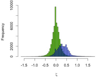
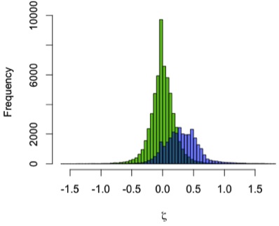
I used the zeta test to compare mandibular growth in a sample of 13 A. robustus and 122 recent humans. I first showed that the method behaves as expected by using it to compare the human sample with itself, resampling 2 pairs of humans rather than a pair of humans and a pair of A. robustus. The green distribution in the graph to the left shows zeta statistics for all possible pairwise comparisons of humans. Just as expected, that it’s strongly centered at zero: only one pattern of growth should be detected in a single sample. (Note, however, the range of variation in the green zetas, the result of individual variation in a cross-sectional sample)

In blue, the human-A. robustus statistics show a markedly different distribution. They are shifted to the right – positive values – indicating that for a given comparison between pairs of specimens, A. robustus increases size more than humans do on average.

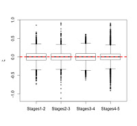
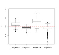
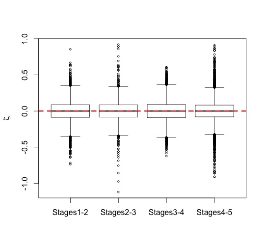
We can also examine how zeta statistics are distributed between different age groups (above). I had broken my sample into five age groups based on stage of dental eruption – the plots above show the distribution of zeta statistics between subsequent eruption stages, the human-only comparison on the left and the human-A. robustus comparison on the right. As expected, the human-only statistics center around zero (red dashed line) across ontogeny, while the human-A. robustus statistics deviate from zero markedly between dental stages 1-2 and 3-4. I’ll explain the significance of this in the next post. What’s important here is that the zeta test seems to be working – it fails to detect a difference when there isn’t one (human-only comparisons). Even better, it detects a difference between humans and A. robustus, which makes sense when you look at the fossils, but had never been demonstrated before.

So there you go, a new statistical method for assessing fossil samples. The next two installments will discuss the results of the zeta test for overall size (important for life history), and for individual traits (measurements; important for evolutionary developmental biology). Stay tuned!

ResearchBlogging.org Several years ago, when I first became interested in growth and development, I changed this blog’s header to show this species’ subadults jaws – it was only last year that I realized this would become the focus of my graduate career.

References
Gordon AD, Green DJ, & Richmond BG (2008). Strong postcranial size dimorphism in Australopithecus afarensis: results from two new resampling methods for multivariate data sets with missing data. American journal of physical anthropology, 135 (3), 311-28 PMID: 18044693

Richtsmeier JT, & Lele S (1993). A coordinate-free approach to the analysis of growth patterns: models and theoretical considerations. Biological Reviews, 68 (3), 381-411 PMID: 8347767

The next big thing? Automated methods in biology, or "Hooked on phenomics"

“This is very beautiful. It is neat, it is modern technology, and it is fast. I am just wondering very seriously about the biological validity of what we are doing with this machine.” – Melvin Moss, 1967*

“This machine” to which Moss referred nearly 50 years ago was not a contraption to clone a Neandertal or a Godzilla-like MechaGodzilla, but a computer. Along these lines, a paper came out recently describing a new, automated method for analyzing (biological) shapes, and while I think the method is pretty sweet, I think future researchers employing it should keep Moss’s monition in mind.

Doug Boyer and colleagues (2011) present “Algorithms to automatically quantify the geometric similarity of anatomical surfaces.” It seems the main goals of the study were to make shape analysis [1] faster and [2] easier for people who don’t otherwise study anatomy (such as geneticists), making it possible [3] to amass large phenotypic datasets comparable to the troves of genetic data accumulated in recent years. Using some intense math that’s way over my head, the computer algorithm takes surface data (acquired through CT or laser scans) of a pair of specimens and automatically fits these forms with a “correspondence map” linking geometrically (and not necessarily biologically) homologous features between the two. It then uses the map to fit landmarks (a la geometric morphometrics) which are used to calculate the shape difference metric between individuals in the pairings.

See at the right just how pretty it is! The authors posit that this technique could be used with genetic knock-out studies to assess how certain genes affect the development of bones and teeth, or to model the development of organs. That certainly would be useful in biomedical and evo-devo research.

But while I appreciate the automated-ness of the procedure, I don’t think we can simply write off the role of the biologist in determining what features are homologous, in favor of a computer. The paper itself illustrates this nicely. The authors state that there is debate about the origins of a cusp on the molar tooth of the sportive lemur (Lepilemur) – is it the same as the entoconid of the living mouse lemur, or the enlarged metaconid of the extinct “koala lemur”? Their automated algorithm can map the sportive lemur’s mystery cusp to match either alternative scenario. It is the external paleontological and phylogenetic evidence, not the intrinsic shape information, that renders the alternative scenario more plausible.

ResearchBlogging.org
So let me reiterate that I think this paper presents an important step for the study of the biology of form, or the form of biology. Automating the analysis of form will certainly expedite studies of large datasets (not to mention freeing up the time of hordes of research assistants). But I hope that researchers employing this procedure will have a little Mossian Angel (poor play on “guardian angel,” sorry) on their shoulders, reminding them that the algorithm won’t necessarily show them homology better than their own experience. And I hope all biologists have this Mossian Angel there, reminding them that even though this method is “neat … modern technology, and … fast,” it may not be the most appropriate method for their research question.

References
Boyer, D., Lipman, Y., St. Clair, E., Puente, J., Patel, B., Funkhouser, T., Jernvall, J., & Daubechies, I. (2011). Algorithms to automatically quantify the geometric similarity of anatomical surfaces Proceedings of the National Academy of Sciences, 108 (45), 18221-18226 DOI: 10.1073/pnas.1112822108

*This quote comes from a discussion at the end of a symposium: Cranio-Facial Growth in Man (1967). RE Moyers and WM Krogman, editors. New York: Pergamon Press.