Materials from the R workshop at #AAPA2016

For last week’s AAPA conference, my friend and colleague David Pappano organized a workshop teaching about the many uses of the R programming language for biological anthropology (I’m listed as co-organizer, but really David did everything). After introducing the basics, we broke into small groups focusing on specific aspects of using R. I devised some lessons for basic statistics, writing functions, and resampling. Since each of the lessons could have easily taken up an hour and most people didn’t get to go through the activities fully, I’m posting up the R codes here for people to mess around with.

The basic stats lesson utilized Francis Galton’s height data for hundreds of families, courtesy of Dr. Ryan Raaum. To load in these data you just need to type into R: galton = read.csv(url(“http://bit.ly/galtondata“)). The code simply shows how to do basic statistics that are built into R, such as  t-test and linear regression.

Example of some summary stats for the Galton height data.

Some summary stats for the Galton  data. The code is in blue and the output in black.

Here is the Basic Stats code, download and paste it into an R file, then buckle up!

The lesson on functions and resampling was based on limb length data for apes, fossil hominins and modern humans (from Dr. Herman Pontzer). The csv file with the data can be downloaded from David’s website. R has lots of great built-in functions (see basic stats, above), and even if you’re looking to do something more than the basics, chances are you can find what you’re looking for in one of the myriad packages that researchers have developed and published over the years. But sometimes it’s necessary to write a function on your own, and with fossil samples you may find yourself needing to do resampling with a specific function or test statistic.

For example, you can ask whether a small sample of “anatomically modern” fossil humans (n=12) truly differs in femur length from a small sample of Neandertals (n=9). Traditional statistics require certain assumptions about the size and distribution of the data, which fossils fail to meet. Another way to ask the question is, “If the two groups come from the same distribution (e.g. population), would random samples of sizes n=12 and n=9 have so great an average difference as we see between the fossil samples?” A permutation test, shuffling the group membership of the fossils and then calculating the difference between the new “group” means, allows you to quickly and easily ask this question:

R code for a simple permutation test.

R code for a simple permutation test. The built-in function “sample()” is your best friend.

Although simply viewing the data suggests the two groups are different (boxplot on the left, below), the permutation test confirms that there is a very low probability of sampling so great a difference as is seen between the two fossil samples.

Left: Femur lengths of anatomically modern humans (AMH) and Neandertals. Right: distribution of resampled group differences. Dashed lines bracket 95% of the resampled distribution, and the red line is the observed difference between AMH and Neandertal femur lengths. Only about 1% of the resampled differences are as great as the observed fossil difference.

Left: Femur lengths of anatomically modern humans (AMH) and Neandertals. Right: distribution of resampled group differences. Dashed lines bracket 95% of the resampled distribution, and the red line is the observed difference between AMH and Neandertal femur lengths. Only about 1% of the resampled differences are as great as the observed fossil difference.

Here’s the code for the functions & resampling lesson. There are a bunch of examples of different resampling tests, way more than we possibly could’ve done in the brief time for the workshop. It’s posted here so you can wade through it yourself, it should keep you busy for a while if you’re new to R. Good luck!

A picture is worth a thousand datapoints in #rstats

I’m finally about to push my study of brain growth in H. erectus out of the gate, and one of the finishing touches was to make pretty pretty pictures. Recall from the last post on the subject that I was resampling pairs of specimens to compute how much proportional brain size change (PSC) occurred from birth a given age in humans and chimpanzees (and now gorillas). This resulted in lots of data points, which can be a bit difficult to read and interpret when plotted. Ah, cross-sectional data. “HOW?!” I asked, “HOW CAN I MAKE THIS MORE DIGESTIBLE?” Having nice and clean plots is useful regardless of what you study, so here I’ll outline some solutions to this problem. (If you want to figure this out for yourself, here are the raw resampled data. Save it as a .csv file and load it into R)

All

Ratios of proportional size change from birth to a later age. Black/gray=humans, green=chimpanzees, red=gorillas. Left are all 2000 resampled ratios, center shows the medians (solid lines) and 95% quantiles of the ratios for each species at a given age (the small gorilla sample is still data points), and right are the loess regression lines and (shaded) 95% confidence intervals. Blue lines across all three plots are the H. erectus median (solid) and 95% quantiles (dashed).

The left-most plot above shows the raw resampled ratios: you can see a lot of overlap between humans (black), chimpanzees (green) and gorillas (red). But all those points are a bit confusing: just how extensive is the overlap? What is the central tendency of each species?

The second plot shows a less noisy way of displaying the results. We can highlight the central tendencies by plotting PSC medians for each age (I used medians and not means since the data are not normally distributed), and rather than showing the full range of variation in PSC at each age, we can simply highlight the majority (95%) of the values.

To make such a plot in R, for each species you need four pieces of information, in vector form: 1) the unique (non-repeated) ages sorted from smallest to largest, and the 2) median, 3) upper 97.5% quantile, and 4) lower 0.025% quantile for each unique age. You can quickly and easily create these vectors using R‘s built-in commands:

R codes to create the vectors of points to be plotted in the second graph. Note that vectors are not created for gorillas because the sample size is too small, or for H. erectus because the distribution is basically the same across all ages.

R codes to create the vectors of points to be plotted in the second graph. Note that vectors are not created for gorillas because the sample size is too small, or for H. erectus because the distribution is basically the same across all ages.

With these simple vectors summarizing humans and chimpanzees variation across ages, you’re ready to plot. The medians (hpm and ppm in the code above) can simply be plotted against age using the plot() and lines() functions, simple enough. But the shaded-in 95% quantiles have to be made using the polygon() function, which creates a shape (a polygon) by connecting sets of points that have to be entered confusingly: two sets of x-coordinates with the first in normal order and the second reversed, and two sets of y-coordinates with the first in normal order and the second reversed.

Plot yourself down and have a beer.

Plot yourself down and have a beer.

In our case, the first set of x coordinates is the vector of sorted, unique ages (h and p in the code), and the second set is the same vector but in reverse. The first set of y coordinates is the vector of 97.5% quantiles (hpu and ppu), and the second set is the vector of 0.025% quantiles in reverse. You can play around with ranges of colors and transparency with “col=….”

What I like about the second plot is that it clearly summarizes the ranges of variation for humans and chimps, and highlights which parts of the ranges overlap: the human and ape medians are comparable at the youngest ages, but by 6 months the human median is pretty much always above the chimpanzee upper range. The gorilla points are generally close to the chimpanzee median until around 2 years after which gorilla size increase basically stops but chimpanzees continue. Importantly, we can also see at what ages the simulated H. erectus values are most similar to the empirical species values, and when they fall out of species’ ranges. As I pointed out a bajillion years ago, the H. erectus values (based on the Mojokerto juvenile fossil) encompass most living species’ values around six months to two years.

I also like that second plot does all the above, and still honestly shows the jagged messiness that comes with cross-sectional, resampled data. Of course no individual’s proportional brain size increases and decreases so haphazardly during growth as depicted in the plot. It’s ugly but it’s honest. But if you like lying to yourself about the nature of your data, if you prefer curvy, smoothed inference to harsh, gritty reality, you can resort to the third plot above: the loess regression lines calculated from the resampled data.

Loess and lowess (not to be confused with loess) refer to locally weighted regression scatterplot smoothing, a way to model gross data like we have, but with a nice and smooth (but not straight) line. Because R is awesome, it has a loess() function built right in. The function easily does the math, and you can quickly obtain confidence intervals for the modelled line, but plotting these is another story. After scouring the internet, coding and failing (repeatedly) I finally came up with this:

Screen Shot 2014-07-26 at 6.57.01 PM

Creating vectors of points makes your lines clean and smooth.

If you simply try to plot a loess() line based on 1000s of unordered points, you’ll get a harrowing spider’s web of lines between all the points. Instead, you need to create ordered vectors of the non-repeated modelled points (hlm, plm, glm, above) and their upper and lower confidence limits. Once modelled, you can simply plot the lines and create polygons based on the confidence intervals as above.

The best way to learn to do stuff in R is to just play around with data and code until you figure out how to do whatever it is you have in mind. If you want to recreate, or alter, what I’ve described here, you can download the resampled data (link at the beginning of the post) and R code. Good luck!

Ima Gona follow up on that last post

Last week, I discussed the implications of the Gona hominin pelvis for body size and body size variation in Homo erectus. One of the bajillion things I have been working on since this post is elaborating on this analysis to write up, so stay tuned for more developments!

Now, when we compared the gross size of the hip joint between fossil Homo and living apes (based on the femur head in most specimens but the acetabulum in Gona and a few other fossils), the range of variation in Homo-including-Gona was generally elevated above variation seen in all living great apes. This is impressive, since orangutans and gorillas show a great range of variation due sexual dimorphism (normal differences between females and males). However, I noted that the specimens I used were unsexed, and so the resampling strategy used to quantify variation within a species – randomly selecting two specimens and taking the ratio of the larger to smaller – probably underestimated sexual dimorphism.

Shortly after I posted this, Dr. Herman Pontzer twitterated me to point out he has made lots of skeletal data freely available on his website (a tremendous resource). The ape and human data I used for last week’s post did not have sexes (my colleague has since sent me that information), but Pontzer’s data are sexed (no, not “sext“). So, I modified and reran the original resampling analysis using the Pontzer data, and it nicely illustrates the difference between using a max/min vs. male/female ratio to compare variation:

Hip joint size variation in living African apes (left and right) compared with fossil humans (genus Homo older than 1 mya, center). Each plot is scaled to show the same y-axis range. On the left are ratios of max/min from resampled pairs from each species (sex not taken into account). On the right are ratios of male/female from resampled pairs from each species. The red dots on this plot are the medians for max/min ratios (the thick black bars in the left plot). The center plot shows ratios of Homo/Gona.

Hip joint size variation in living African apes (left and right) compared with fossil humans (genus Homo older than 1 mya, center). Each plot is scaled to show the same y-axis range. On the left are ratios of max/min from resampled pairs from each species (sex not taken into account). On the right are ratios of male/female from resampled pairs from each species. The red stars on this plot are the medians for max/min ratios (the thick black bars in the left plot). The center plot shows ratios of Homo/Gona.

The left plot shows resampled ratios of max/min in humans, chimpanzees and gorillas, while the right shows ratios of male/female in these species. If no assumption is made about a specimen’s sex (left plot), it is possible to resample a pair of the same sex, and so it is likelier to sample two individuals similar in size. Note that the ratio of max/min can never be less than 1. However, if sex is taken into account (right plot), we see two key differences. First, because of size overlap between males and females in humans and chimpanzees, ratios can fall below 1. Adult gorilla males are much larger than females, and so the ratio is never as low as 1 (minimum=1.08). Second, in more dimorphic species, the male/female ratio is elevated above the max/min ratio (red stars in the right plot). In chimpanzees, the median male/female ratio is actually just barely lower than the median max/min ratio. If you want numbers: the median max/min ratios for humans, chimpanzees and gorillas are 1.09, 1.06 and 1.16, respectively. The corresponding median male/female ratios are 1.15, 1.06 and 1.25.

Regarding the fossils, if we assume that Gona is female and all other ≥1 mya Homo hips are male, the range of hip size variation can be found within the gorilla range, and less often in the human range.

But the story doesn’t end here. One thing I’ve considered for the full analysis (and as Pontzer also pointed out on Twitter) is that the relationship between hip joint size and body weight is not the same between humans and apes. As bipeds, we humans place all our upper body weight on our hips; apes aren’t bipedal and so relatively less of their weight is transmitted through this joint. As a result, human hip joint size increases faster with increasing body mass than it does in apes.

So for next installment in this fossil saga, I’ll consider body mass variation estimated from hip joint size. Based on known hip-body size relationships in humans vs. apes, we can predict that male/female variation in humans and fossil hominins will be relatively higher than the ratios presented here – will this put fossil Homo-includng-Gona outside the gorilla range of variation? Stay tuned to find out!

Gona … Gona … not Gona work here anymore more

The Gona pelvic remains (A-D), and the reconstructed complete pelvis (E-J), Fig. 2 in Simpson et al., 2008.

A few years ago, Scott Simpson and colleagues published some of the most complete fossil human hips (right). The fossils are from the Busidima geological formation in the Gona region of Ethiopia, dated to between 0.9-1.4 million years ago. (Back when I wasn’t the only author of this blog, my friend and colleague Caroline VanSickle wrote about it here)

Researchers attributed the pelvis to Homo erectus on the basis of its late geological age and a number of derived (Homo-like) features. In addition, the pelvis’s very small size indicated it probably belonged to a female. One implication of this fossil was that male and female H. erectus differed drastically in body size.

Christopher Ruff (2010) took issue with how small this specimen was, noting that its overall size is more similar to the small-bodied Australopithecus species. Using the size of the hip joint as a proxy for body mass, Ruff argued Gona’s small size would imply a profound amount of sexual dimorphism in H. erectus: much higher than if Gona is excluded from this species, and higher than in modern humans or other fossil humans. Ruff thus proposed an alternative hypothesis to marked sexual dimorphism, that the Gona pelvis may have belonged to an australopithecine.

Fig. 3 From Ruff's (2010) reply. Australopiths (and Orrorin) are squares and Homo are circles. Busidima's estimated femur head diameter is represented by the star and bar.

Fig. 3 From Ruff’s (2010) reply. Australopiths (and Orrorin) are squares and Homo are circles. Gona’s estimated femur head diameter is represented by the star and bar.

Now, Simpson & team replied to Ruff’s comments, providing a laundry list of reasons why this pelvis is H. erectus and not Australopithecus. They cite many anatomical features of the pelvis shared with Gona and Homo fossils, but not australopithecines. They also note that there are many other bones reflective of body size, that seem to suggest a substantial amount of size variation in Homo fossils, even those from a single site such as Dmanisi (Lordkipanadze et al., 2007).

Interestingly, neither of these parties compared the implied size variation with that of living apes. So I’ll do it! Now, I do not have any acetabulum data, but a friend lent me some femur head measurements for living great apes a few years ago. Gona is a pelvis and not a femur, but there are more fossil femora than hips. Because there’s a very high correlation between femur head and acetabulum size, Ruff estimated Gona’s femur head diameter to be 32.6 mm (95% confidence interval: 30.1-35.2; Simpson et al. initially estimated 35.1 mm based on a different dataset and method). To quantify size variation, we can compare ratios of larger femur heads divided by smaller ones. Now, this ratio quantifies inter-individual variation, but it will underestimate sexual dimorphism since I’m likely sampling some same-sex pairs that aren’t so different in size. But this is just a quick and dirty look. So, here’s a box plot of these ratios for Homo fossils, larger specimens divided by Gona’s estimated femur head size in different time periods:

Ratio of a fossil Homo femur head diameter (HD) divided by Busidima's HD. E Homo = early Pleistocene, Contemporaneous = WT 15000 and OH 28, MP = Middle Pleistocene Homo. White boxes are based on Ruff's Busidima HD estimate, green boxes are based on Simpson et al.'s estimate.

Ratios of fossil Homo femur head diameter (HD) divided by Busidima’s (Gona’s) HD. E Homo = early Pleistocene, Contemporaneous = WT 15000 and OH 28, MP = Middle Pleistocene Homo. White boxes are based on Ruff’s Gona HD estimate, green boxes are based on Simpson et al.’s larger estimate. Boxes include 50% quartiles and the thick lines within are sample medians.

Clearly, Gona is much smaller than most other fossil Homo hips, since ratios are never smaller than 1.14. Average body size increases over time in the Homo lineage, reflected in increasing ratios from left to right on the plot. Early Pleistocene Homo fossils are fairly small, including Dmanisi, hence the lower ratios than later time periods. Middle Pleistocene Homo (MP), represented by the most fossils, shows a large range of variation, but even the smallest is still 1.17 times larger than the largest estimate of Gona’s femur head size. To put this into context, here are those green ratios (assuming a larger size for Gona) compared with large/small ratios from resampled pairs of living apes and humans:

*

The fossil ratios of larger/smaller HD from above, compared with resampled ratios from unsexed living apes and humans. Boxes include the 50% quartiles, and the thick lines within are sample medians. **(05/03/14: This plot has been modified from the original version post, which only included the fossil ratios based on the smaller Gona estimate)

What we see for the extant apes and humans makes sense: humans and chimpanzees show smaller differences on average, whereas average differences between gorillas and orangutans are larger. This accords with patterns of sexual dimorphism in these species. **What this larger box plot shows is that if we accept Ruff’s smaller average estimate of Gona’s femur head size (white boxes), it is relatively rare to sample two living specimens so different in size as seen between Gona and other fossils. If we use Simpson et al.’s larger Gona size estimate, variation is still elevated above most living ape ratios. Only when Gona is compared with the generally-smaller, earlier Pleistocene fossils, does the estimated range of variation show decent overlap with living species. Even then, the overlap is still above the median values.

These results based on living species agree with Ruff’s concern, that including Gona in Homo erectus results in an unusually large range of variation in this species. Such a large size range isn’t necessarily impossible, but it would be surprising to see more variation than is common in gorillas and orangutans, where sexual size dimorphism is tremendous. Ruff suggested that the australopith-sized Gona pelvis may in fact be an australopith. This was initially deemed unlikely, in part because the fossil is well-dated to relatively late, 0.9-1.4 million years ago. However, Dominguez-Rodgrigo and colleauges (2013) recently reported a 1.34 mya Australopithecus boisei skeleton from Olduvai Gorge, so it is possible that australopiths persisted longer than we’ve got fossil evidence for, and Gona is one of the latest holdouts.

So many possible explanations. More clarity may come with further study of the fossils at hand, but chances are we won’t be able to eliminate any of these possibilities until we get more fossils. (also, the post title wasn’t a jab at the fossils or researchers, but rather a reference to the movie Office Space)

References

Dominguez-Rodrigo et al. 2013. First partial skeleton of a 1.33-million-year-old Paranthropus boisei from Bed II, Olduvai Gorge, Tanzania. PLoS One 8: e80347.

Ruff C. 2010. Body size and body shape in early hominins – implications of the Gona pelvis. Journal of Human Evolution 58: 166-178.

Simpson S et al. 2008. A female Homo erectus pelvis from Gona, Ethiopia. Science 322: 1089-1092.

Simpson S et al. In press. The female Homo pelvis from Gona: Response to Ruff (2010). Journal of Human Evolution. http://dx.doi.org/10.1016/j.jhevol.2013.12.004

Molar? I hardly even know her!

I was recently at the State Zoology Museum of Munich, studying their amazing plethora of orangutan bones. Jaw bones are especially useful skeletal remains when you study growth, because different teeth come in at different points in one’s life. Remember when your 1st permanent molar teeth came in? You were probably 5 or 6 years old at the time. It was a big deal, your first permanent teeth! What about your 4th permanent molars, after your wisdom teeth, remember those?

An adult male orangutan mandible, with bilateral supernumerary molars. Or more simply, “an extra molar on both sides of the jaw.”
I hope not. As a good eutherian, you should never have more than 3 molars in each half of each jaw. And as a modern human, there’s a good chance you’ve only got 2 in each half (but that’s a whole other story). So when I was looking at orangutan skulls to get an idea of individuals’ ages, I was shocked to find specimen after specimen with at least one extra molar. So far as I could tell, 27 out of 181 (14.9%) adult orangutans in this collection had extra molars.
Supernumerary (fancy word for “extra”) molars manifest a number of ways in this collection. Sometimes there’s only one extra tooth. Sometimes there are extra teeth in both upper and lower jaws but only on one side. Sometimes there’s a full set (4). Et cetera. One poor bastard even had a 5th molar lurking behind one of his four 4ths! Deplorable.

An adult male with a fairly normal 4th (blue arrow) and even a weird, unerupted 5th (red arrow) molar. Gross!
This is rather strange, such a regular occurrence of supernumerary teeth – what gives? A starting clue is the fact that all specimens with extra molars are of the species Pongo pygmaeus from Borneo (173 of 181 specimens). The remaining eight specimens, with a normal dental formula, are Pongo abelii from the island of Sumatra. But how much of this difference in frequency is due to the fact we’re looking at 181 Bornean, vs. only eight Sumatran orangutans?
Resampling to the rescue! Is it weird that 27/181 (15%) Bornean orangutans have extra teeth, while 0/8 Sumatran orangs do not? Another way to ask the question is, what are the chances of sampling 8 Bornean orangs, none of which have extra molars? This is very easy to program and test in R:
Set up a vector (basically, a string of numbers) to represent your Bornean orangs, each entry representing an individual, assigning “0” for no extra teeth and “1” for at least one (this admittedly oversimplifies the nature of extra teeth). Then simply randomly sample – lots and lots of times –  eight individuals from this Bornean vector, to see how often you get a set in which 0/8 have extra molars.
“b” is our vector of Bornean orangutans, consisting of 0s and 1s for whether there are extra teeth. “n” tells us how many individuals had extra teeth in that subsample. The “(i in 1:10000)” means for each of 10,000 resamplings.
Following this resampling procedure, there’s about a 25.5% chance that none of them will have extra molars. That means the remaining 74.5% of the time, a random subsample of the Bornean orangutans will contain at least one individual with at least one extra tooth.
A number of interesting questions arise from this – if we were to examine more Sumatran orangutans, would we eventually find one with an extra molar? After all, the 25.5% chance of sampling 0/8 suggests maybe we just missed some Sumatrans with extra molars. Regardless, within the Bornean orangs, why is the frequency so high? Does one pattern of extra teeth (say, just in the lower jaw, or on both sides, etc.) predominate? Are there differences between the sexes? These are questions for another day….

Update: Brain growth in Homo erectus, and the age of the Mojokerto fossil

The Mojokerto calvaria. You’re looking at the left side of the
 skull: the face would be to the left. Check it out in 3D here.

A few months ago I posted an abridged version of the presentation I gave at this year’s meetings of the American Association of Physical Anthropologists, about brain growth in Homo erectus. This study, co-authored with Jeremy DeSilva, adopts a novel approach (see “Methods” in that earlier post) to analyze the Mojokerto fossil (right). The specimen is the only H. erectus non-adult complete enough to get a decent estimate of brain size (or rather, the overall volume of the brain case) – probably 630 to 660 cubic centimeters (Coqueugniot et al. 2004; Balzeau et al., 2004). So to study brain growth in the extinct species, we just have to connect a range of estimated brain sizes at birth (around 290 cubic centimeters, based on predictive equations by DeSilva and Lesnik, 2008) to that of Mojokerto. But, the speed of brain growth implied by this comparison depends on how old poor Mojokerto was when s/he died.

Most recently, Hélen Coqueugniot and colleagues (2004) used CT scans of the fossil to examine the fusion of its various bones, to suggest the poor kid died between six months to 1.5 years, if not even younger. Antoine Balzeau and team (2005) also studied scans of the fossil, and their analysis of its virtual endocast presented conflicting age estimates, but they argued the poor kid was probably no older than 4 years. Earlier studies had suggested the kid was up to 8 years. Now, for my previous post/conference presentation, we assumed the Coqueugniot estimate was correct – but what if we consider a full range of ages for Mojokerto, from 0.03-6.00 years?

Brain size, relative to newborns’ values, at different ages in humans (black circles) and chimpanzees (red triangles). Homo erectus median and mean are the thick solid and dashed blue lines, respectively, and the 90% and 95% confidence intervals are indicated by the thinner, dotted blue lines. Data are the same as in the previous post.

The plot above depicts brain size relative to newborns: each circle (humans) and triangle (chimpanzees) represents the proportional size difference between a newborn (less than 1 week) and an older individual, up to 6 years. Obviously, relative brain size gets bigger in humans and chimpanzees over time. Interestingly, even though humans and chimps have very different brain sizes, the proportional brain size changes overlap a lot between species, especially at younger ages. Ah, the joys of cross-sectional samples.

But what’s especially interesting here are the blue lines on the graph, indicating estimates of proportional size change in Homo erectus, assuming Mojokerto’s skull could hold 630 cc of delicious brain matter, and that the species’ skulls at birth could hold about 290 cc, give or take several cc. The thick solid and dashed lines just above 2 on the y-axis are the mean and median of our estimates – Mojokerto’s brain averages around 2.2 times larger than predicted newborns. Such a proportion is most likely to be found in humans between 6 months to a year of age, and in chimpanzees between around 6 months and 2 years. The confidence intervals, the highest and lowest bounds of our estimates for Homo erectus proportional size change, are the thinner dashed lines on the graph. They help us constrain our estimates, and further suggest that the proportional difference found for H. erectus is most likely to be found in either chimpanzees or humans around 1 year of age – just like Coqueugniot and colleagues predicted!!!

Thus, independent evidence – brain size of Mojokerto and estimated brain size at birth in Homo erectus – corroborates a previously estimated age at death for the Mojokerto fossil, the poor little Homo erectus baby. This further supports our estimates of brain growth rates in this species, as described in the previous post.

ResearchBlogging.orgSo to summarize, fairly scant fossil evidence compared with larger extant species samples using randomization statistics, argue for high, human-like infant brain growth rates in Homo erectus by around 1 million years ago. Our ancestors were badasses.

Remember, if you want the R code I wrote to do this study, just lemme know!

Those references
Balzeau A, Grimaud-Hervé D, & Jacob T (2005). Internal cranial features of the Mojokerto child fossil (East Java, Indonesia). Journal of human evolution, 48 (6), 535-53 PMID: 15927659

Coqueugniot H, Hublin JJ, Veillon F, Houët F, & Jacob T (2004). Early brain growth in Homo erectus and implications for cognitive ability. Nature, 431 (7006), 299-302 PMID: 15372030

DeSilva JM, & Lesnik JJ (2008). Brain size at birth throughout human evolution: a new method for estimating neonatal brain size in hominins. Journal of human evolution, 55 (6), 1064-74 PMID: 18789811

Pre-publication: Brain growth in Homo erectus (plus free code!)

The annual meetings of the American Association of Physical Anthropologists were going on all last week, and I gave my first talk before the Association (co-authored with Jeremy DeSilva). The talk focused on using resampling methods and the abysmal human fossil record to assess whether human-like brain size growth rates were present in our >1 mya ancestor Homo erectus. This is something I’ve actually been sitting on for a while, and wanted to wait til after the talk to post for all to see. I haven’t written this up yet for publication, but before then I’d like to briefly share the results here.

Background: Humans’ large brains are critical for giving us our unique capabilities such as language and culture. We achieve these large (both absolutely, and relative to our body size) brains by having really high brain growth rates across several years; most notable are exceptionally high, “fetal-like” rates during the first 1-2 years of life. Thus, rapid brain growth shortly after birth is a key aspect of human uniqueness – but how ancient is this strategy?

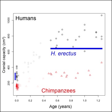
Materials: We can plot brain size at birth in humans and chimpanzees (our closest living relatives) to visualize what makes humans stand out (Figure 1).

Figure 1. Brain size (volume) at given ages. Humans=black, chimpanzees=red. Ranges of brain size at birth, and the chronological age of the Mojokerto fossil, in blue.

Human data come from Cogueugniot and Hublin (2012), and chimpanzees from Herndon et al. (1999) and Neubauer et al. (2012). The earliest fossil evidence able to address this question comes from Homo erectus. Because of the tight relationship between newborn and adult brain size (DeSilva and Lesnik 2008), we can use adult Homo erectus brain volumes (n=10, mean = 916.5 cm^3) to predict that of the species’ newborns: mean = 288.9 cm^3, sd = 17.1). An almost-recent analysis of the Mojokerto Homo erectus infant calvaria suggests a size of 663 cm^3 and an age of 0.5-1.25 years (Coqueugniot et al. 2004; this study actually suggests an oldest age of 1.5 years, but the chimpanzee sample here requires us to limit the study to no more than 1.25 years). Because we have a H. erectus fossil less than 2 years of age, and we can estimate brain size at birth, we can indirectly assess early brain growth in this species.

Methods: Resampling statistics allow inferences about brain growth rates in this extinct species, incorporating the uncertainty in both brain size at birth, and in the chronological age of the Mojokerto fossil. We thus ask of each species, what growth rates are necessary to grow one of the newborn brain sizes to any infant between 0.5-1.25 years? And from there, we compare these resampled growth rates (or rather, ‘pseudo-velocities’) between species – is H. erectus more similar to modern humans or chimpanzees? There are 294 unique newborn-infant comparisons for humans and 240 for the chimpanzee sample. We therefore compare these empirical newborn-infant pairs from extant species to 7500 resampled H. erectus pairs, randomly selecting a newborn H. erectus size based on the parameters above, and randomly selecting an age from 0.5-1.25 years for the Mojokerto specimen. This procedure is used to compare both absolute size change (the difference between an infant and a newborn size, in cm^3/year), and and proportional size change (infant/newborn size).

Results: Humans’ high early brain growth rates after birth are reflected in the ‘pseudovelocity curve’ (Figure 2). Chimps have a similar pattern of faster rates earlier on, but these are ultimately lower than humans’. Using the Mojokerto infant’s brain size (and it’s probable ages) and the likely range of H. erectus neonatal brain sizes (mean = 288, sd = 17), it is fairly clear that H. erectus achieved its infant brain size with high, human-like rates in brain volume increase.

Figure 2. Brain size growth rates (‘pseudo-velocity’) at given ages. Humans=black, chimpanzees=red, and Homo erectus,=blue.

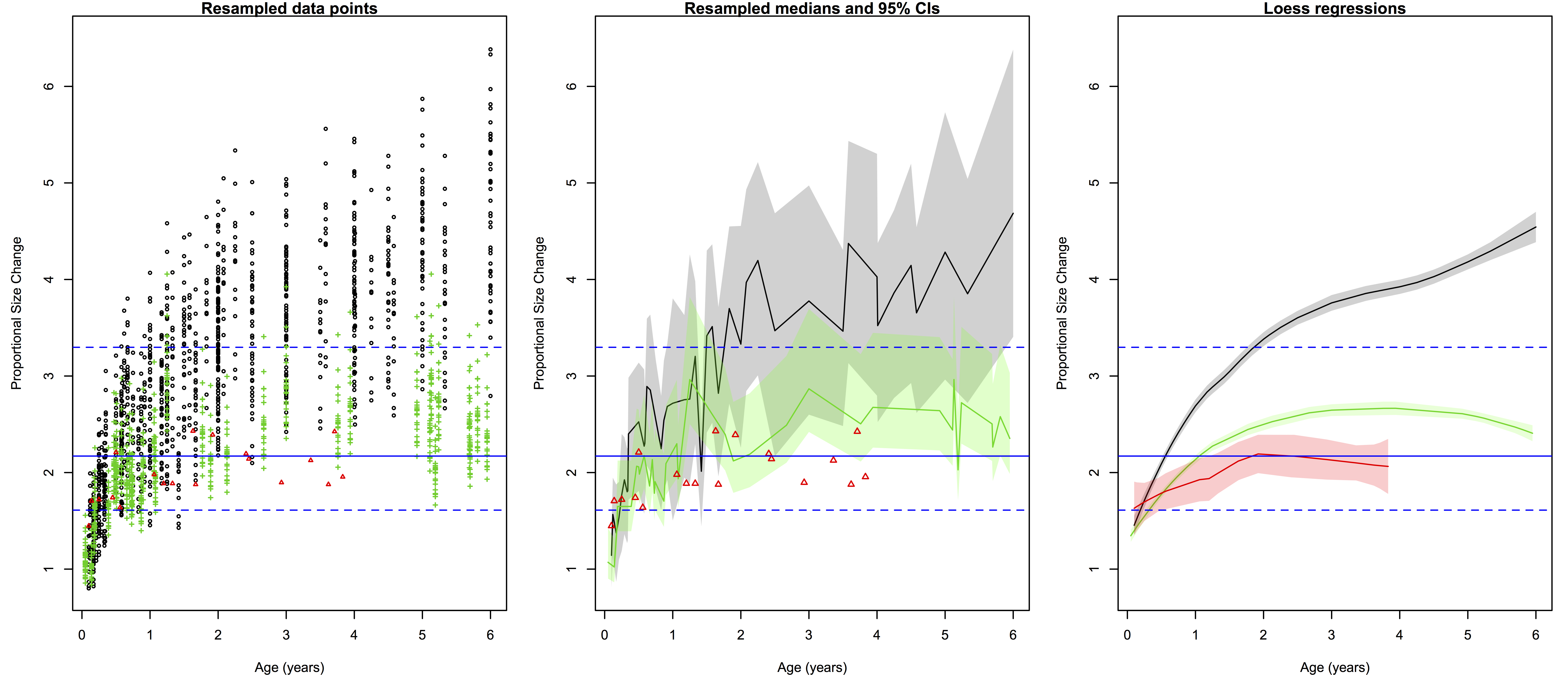
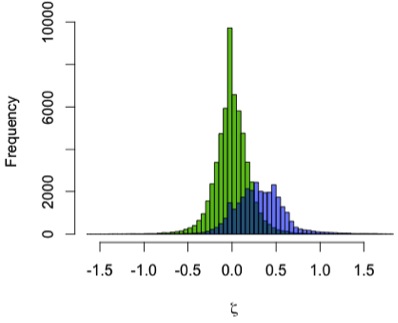
However, if we look at proportional size change, the factor by which brain size increases from birth to a given age, we see a great deal of overlap both between age groups within a species, and between different species. Cross-sectional data create a great deal of overlap in implied proportional size change between ages within a species; it is easier to consider proportional size change between taxa, conflating ages, then  (Figure 3). Humans show a massive amount of variation in potential growth rates from birth to 0.5-1.25 years, and chimpanzees also show a great deal of variation, albeit generally lower than in the human sample. Relative growth rates in Homo erectus are intermediate between the two extant species.

Figure 3. Proportional brain size increase (infant/newborn size). 

Significance: Brain size growth shortly after birth is critical for humans’ adaptative strategy: growing a large brain requires a lot of energy and parental (especially maternal) investment (Leigh 2004). Plus, in humans this rapid increase may correspond with the creation of innumerable white-matter connections between regions of the brain (Sakai et al. 2012), important for cognition or intelligence. The H. erectus fossil record (1 infant and 10 adults) provides a limited view into this developmental period. However, comparative data on extant animals (e.g. brain sizes from birth to adulthood), coupled with resampling statistics, allow inferences to be made about brain growth rates in H. erectus over 1 million years ago.

Assuming the Mojokerto H. erectus infant is accurately aged (Coqueugniot et al. 2004), and that Homo erectus followed the same neonatal-adult scaling relationship as other apes and monkeys (DeSilva and Lesnik 2008), it is likely that H. erectus had human-like rates of absolute brain size growth. Thus, the energetic and parental requirements to raise such brainy babies, seen in modern humans, may have been present in Homo erectus some 1.5 million years ago or so. This may also imply rapid white-matter proliferation (i.e. neural connections) in this species, suggesting an intellectually (i.e. socially or linguistically) stimulating infancy and childhood in this species. At the same time, relative brain size growth appears to scale with overall brain size: larger brains require proportionally higher growth rates. This is in line with studies suggesting that in many ways, the human brain is a scaled-up version of other primates’ (e.g. Herculano-Houzel 2012).

ResearchBlogging.org
This study was made possible with published data, and the free statistical programming language R.

Contact me if you want the R code used for this analysis, I’m glad to share it!!!

References
Coqueugniot H, Hublin JJ, Veillon F, Houët F, & Jacob T (2004). Early brain growth in Homo erectus and implications for cognitive ability. Nature, 431 (7006), 299-302 PMID: 15372030

Coqueugniot H, & Hublin JJ (2012). Age-related changes of digital endocranial volume during human ontogeny: results from an osteological reference collection. American journal of physical anthropology, 147 (2), 312-8 PMID: 22190338

DeSilva JM, & Lesnik JJ (2008). Brain size at birth throughout human evolution: a new method for estimating neonatal brain size in hominins. Journal of human evolution, 55 (6), 1064-74 PMID: 18789811

Herculano-Houzel S (2012). The remarkable, yet not extraordinary, human brain as a scaled-up primate brain and its associated cost. Proceedings of the National Academy of Sciences of the United States of America, 109 Suppl 1, 10661-8 PMID: 22723358

Herndon JG, Tigges J, Anderson DC, Klumpp SA, & McClure HM (1999). Brain weight throughout the life span of the chimpanzee. The Journal of comparative neurology, 409 (4), 567-72 PMID: 10376740

Leigh SR (2004). Brain growth, life history, and cognition in primate and human evolution. American journal of primatology, 62 (3), 139-64 PMID: 15027089

Neubauer, S., Gunz, P., Schwarz, U., Hublin, J., & Boesch, C. (2012). Brief communication: Endocranial volumes in an ontogenetic sample of chimpanzees from the taï forest national park, ivory coast American Journal of Physical Anthropology, 147 (2), 319-325 DOI: 10.1002/ajpa.21641

Sakai T, Matsui M, Mikami A, Malkova L, Hamada Y, Tomonaga M, Suzuki J, Tanaka M, Miyabe-Nishiwaki T, Makishima H, Nakatsukasa M, & Matsuzawa T (2012). Developmental patterns of chimpanzee cerebral tissues provide important clues for understanding the remarkable enlargement of the human brain. Proceedings. Biological sciences / The Royal Society, 280 (1753) PMID: 23256194

A new method for analyzing growth in extinct animals (dissertation summary 1)

The last year and a half was a whirlwind, and so I never got around to blogging about the fruits of my dissertation: Mandibular growth in Australopithecus robustus… Sorry! So this post will be the first installment of my description of the outcome of the project. The A. robustus age-series of jaws allowed me to address three questions: [1] Can we statistically analyze patterns of size change in a fossil hominid; [2] how ancient is the human pattern of subadult growth, a key aspect of our life history;  and [3] how does postnatal growth contribute to anatomical differences between species? This post will look at question [1] and the “zeta test,” new method I devised to answer it.

Over a year ago, and exactly one year ago, I described some of the rational for my dissertation. Basically, in order to address questions [2-3] above, I had to come up with a way to analyze age-related variation in a fossil sample. A dismal fossil record means that fossil samples are small and specimens fragmentary – not ideal for statistical analysis. The A. robustus mandibular series, however, contains a number of individuals across ontogeny – more ideal than other samples. Still, though, some specimens are rather complete while most are fairly fragmentary, meaning it is impossible to make all the same observations (i.e. take the same measurements) on each individual. How can growth be understood in the face of these challenges to sample size and homology?

Because traditional parametric statistics – basically growth curves – are ill-suited for fossil samples, I devised a new technique based on resampling statistics. This method, which I ended up calling the “zeta test,” rephrases the question of growth, from a descriptive to a comparative standpoint: is the amount of age-related size change (growth) in the small fossil sample likely to be found in a larger comparative sample? Because pairs of specimens are likelier to share traits in common than an entire ontogenetic series, the zeta test randomly grabs pairs of differently-aged specimens from one sample, then two similarly aged specimens from the second sample, and compares the 2 samples’ size change based only on the traits those two pairs share (see subsequent posts). Pairwise comparisons maximize the number of subadults that can be compared, and further address the problem of homology. Then you repeat this random selection process a bajillion times, and you’ve got a distribution of test statistics describing how the two samples differ in size change between different ages. Here’s a schematic:

1. Randomly grab a fossil (A) and a human (B) in one dental stage (‘younger’), then a fossil and a human in a different dental stage (‘older’). 2. Using only traits they all share, calculate relative size change in each species (older/younger): the zeta test statistic describes the difference in size change between species. 3. Calculate as many zetas as you can, creating a distribution giving an idea of how similar/different species’ growth is.

The zeta statistic is the absolute difference between two ratios – so positive values mean species A  grew more than species B, while negative values mean the opposite. If 0 (zero, no difference) is within the great majority of resampled statistics, you cannot reject the hypothesis that the two species follow the same pattern of growth. During each resampling, the procedure records the identity and age of each specimen, as well as the number of traits they share in common. This allows patterns of similarity and difference to be explored in more detail. It also makes the program run for a very long time. I wrote the program for the zeta test in the statistical computing language, R, and the codes are freely available. (actually these are from April, and at my University of Michigan website; until we get the Nazarbayev University webpage up and running, you can email me for the updated codes)

The zeta test itself is new, but it’s based on/influenced by other techniques: using resampling to compare samples with missing data was inspired by Gordon et al. (2008). The calculation of ‘growth’ in one sample, and the comparison between samples, is very similar to as Euclidean Distance Matrix Analysis (EDMA), devised in the 1990s by Subhash Lele and Joan Richtsmeier (e.g. Richtsmeier and Lele, 1993). But since this was a new method, I was glad to be able to show that it works!

I used the zeta test to compare mandibular growth in a sample of 13 A. robustus and 122 recent humans. I first showed that the method behaves as expected by using it to compare the human sample with itself, resampling 2 pairs of humans rather than a pair of humans and a pair of A. robustus. The green distribution in the graph to the left shows zeta statistics for all possible pairwise comparisons of humans. Just as expected, that it’s strongly centered at zero: only one pattern of growth should be detected in a single sample. (Note, however, the range of variation in the green zetas, the result of individual variation in a cross-sectional sample)

In blue, the human-A. robustus statistics show a markedly different distribution. They are shifted to the right – positive values – indicating that for a given comparison between pairs of specimens, A. robustus increases size more than humans do on average.

We can also examine how zeta statistics are distributed between different age groups (above). I had broken my sample into five age groups based on stage of dental eruption – the plots above show the distribution of zeta statistics between subsequent eruption stages, the human-only comparison on the left and the human-A. robustus comparison on the right. As expected, the human-only statistics center around zero (red dashed line) across ontogeny, while the human-A. robustus statistics deviate from zero markedly between dental stages 1-2 and 3-4. I’ll explain the significance of this in the next post. What’s important here is that the zeta test seems to be working – it fails to detect a difference when there isn’t one (human-only comparisons). Even better, it detects a difference between humans and A. robustus, which makes sense when you look at the fossils, but had never been demonstrated before.

So there you go, a new statistical method for assessing fossil samples. The next two installments will discuss the results of the zeta test for overall size (important for life history), and for individual traits (measurements; important for evolutionary developmental biology). Stay tuned!

ResearchBlogging.org Several years ago, when I first became interested in growth and development, I changed this blog’s header to show this species’ subadults jaws – it was only last year that I realized this would become the focus of my graduate career.

References
Gordon AD, Green DJ, & Richmond BG (2008). Strong postcranial size dimorphism in Australopithecus afarensis: results from two new resampling methods for multivariate data sets with missing data. American journal of physical anthropology, 135 (3), 311-28 PMID: 18044693

Richtsmeier JT, & Lele S (1993). A coordinate-free approach to the analysis of growth patterns: models and theoretical considerations. Biological Reviews, 68 (3), 381-411 PMID: 8347767

Programming Update: Resampling procedure

In the last post, I was talking about learning to program in R. I was able to re-program a resampling project that I’d written in Visual Basic, but I could not figure out how to store my resampled test-statistics, so I could plot a histogram of their distribution. Last night, after searching the world wide webs, I stumbled upon an even shorter code for resampling. I was able to tweak that code to the specs of what I wanted it to do, and–voila–I have a program that resamples my comparative sample, takes two specimens and computes a test statistic, compares that to my fossil specimens, and repeats the process as many times as I want. I’ll print the code at the end for readers to mess with if they want.

The basic idea of the project is that the “habiline” cranial fossils–early Homo from 1.9-1.6 million years ago are quite variable. Because of this, researchers have tried to fit these square pegs of fossils into round holes of species–H. habilis and rudolfensis. A simple, univariate trait that has been claimed to be evidence of multiple species is cranial capacity variation. For a long time this idea was propagated by comparing ER 1470 with ER 1813, because the two have very different cranial capacities and were thought to date to 1.9 Ma. Turns out, though, that while ER 1470 is 1.9 Ma, and ER 1813 might be closer to 1.65 Ma (Gathogo and Brown 2006). Gathogo and Brown state that a more geologically apt comparison, then, would be between ER 1813 and ER 3733. For the 1.9 Ma interval, the most disparate comparison is between ER 1470 and OH 24. Here’s the summary of specimens, ages, and their cranial capacities:

1.9 Ma: ER 1470 (752 cc) and OH 24 (590 cc)

1.65 Ma: ER 3733 (848 cc) and ER 1813 (510 cc)

Ratio of ER 1470/OH24 = 1.274

Ratio of ER 3733/ER 1813 = 1.663

So I wrote a program that tests the null hypothesis that early habiline cranial capacity variation is no different from that of extant gorillas–gorillas being one of the most size-dimorphic living relatives of hominins. If I cannot reject the null hypothesis, this would suggest that I cannot reject the idea that the habiline fossils sample a single species, based on cranial capacities. To test this, I took the ratio of the larger cranial capacity to the smallest, rather than male to female–this makes it easier to compare to the max-min ratio of habilines, without having to assume the sex of the specimens. The resampling program randomly selects two gorilla specimens, takes the ratio of the larger to the smaller, and repeats 5000 times. This way, I can assess the probability of randomly sampling two gorilla cranial capacities that are as different as the two sets of habilines.

The results, displayed in the histogram, show that there is a 25% chance of sampling two gorilla cranial capacities as different as the early habilines (1.9 Ma). However, there is only a 0.006% chance of sampling to gorillas as different as ER 1813 and ER 3733. Thus, we reject the null hypothesis for the comparison of ER 3733 and ER 1813. This means it is very unlikely that these two specimens come from a single species with a level of dimorphism/variation similar to modern day gorillas. This could mean that the two represent two different, contemporaneous species, or that they represent a single species with a level of variation greater than in our extant analog. The test cannot distinguish between these alternatives.Histogram of the resampled gorilla cranial capacity ratios. Notice that it is one-tailed. The red-dashed line indicates the 95th percentile. The early habiline ratio (E) is well within the 95 limit, while the later ratio (L) is outside the 95th percentile.

Here’s the code (the first two lines tell the program where to find the data, since I haven’t posted these, in order to run this program you’ll need a) to reset the directory to where you store your data [use the setwd() command] and b) a data file with cranial capacities listed in a single column, the first four of which are the habilines, and the remainder your comparative sample)


setwd(“C:/Users/zacharoo/Documents/Data”)

get <- read.csv("CranCaps.csv")

habs <- get[1:4,2]

OH24 <- habs[1]; ER1470 <- habs[2]; ER1813 <- habs[3]; ER3733 <- habs[4]

early <- ER1470/OH24; late <- ER3733/ER1813

gors <- get[5:105,2]

p = 0 # incremented if G1/G2 >= “early”

q = 0 # incremented if G1/G2 >= “late”

n = 5000 # <– NUMBER OF ITERATIONS !!!

gor.boot <- numeric(n) # x-number vector containing test statistics

for (i in 1:n) {

sub.samp <- gors[sample(101,2, replace = FALSE)] # sub.samp = 2 randomly sampled gorillas

G1 <- sub.samp[1]; G2 <- sub.samp[2]

if (G1 >= G2) {ratio <-G1/G2} else {ratio <-G2/G1}

gor.boot[i] <- ratio

if (gor.boot[i] >= early) {p = p +1} else {p = p} #frequencies

if (gor.boot[i] >= late) {q = q +1} else {q = q}

}

pval <- p/i

qval <- q/i

qntl <- quantile(gor.boot, .95)

hist(gor.boot, col = 3, xlab = “Resampled Gorilla ratio”, ylab = “Frequency”, main = “Frequency Distribution”)

points(early,25, pch = “E”, col = 2, cex = 1.25); points(late,25, pch = “L”, col = 2, cex = 1.25)

abline(v = qntl, col = 2, lty = 6) # line marking the 95% limit

print(pval); print(qval)

summary(gor.boot)


Reference

Gathogo PN, and Brown FH. 2006. Revised stratigraphy of Area 123, Koobi Fora, Kenya, and new age estimates of its fossil mammals, including hominins. Journal of Human Evolution 51(5):471-479.

Programming

I’m no wiz when it comes to computers, but lots of really smart people have told me I’d do myself an academic favor by learning to write programs. In Paleobiology last year, Phil Gingerich introduced me to programming in Visual Basic. While I did not become so proficient to find it as useful he did, it still got me interested. Then last semester, Milford urged me and other lawnchair anthropologists to take a course in the department of Ecology and Evolutionary Biology taught by George Estabrook, where we learned to write resampling programs for Excel in Visual Basic. It was a bit stressful at times–reading and writing computer codes at first was like learning to read and write Japanese with little training. But overall I thought it was a very useful class, and I’ll certainly be writing more resampling programs in the future (i.e. for my Australopithecus robustus projects…).

But the computer language that everybody’s been abuzz about in the past year or so is R. To quote the website (see the link), “R is a language and environment for statistical computing and graphics.” The software and codes for it are available FOR FREE on the website. I’ve been meaning to sit down and figure out how to use it for a year now, and now that I’m all alone at the museum in the evenings, I’ve begun learning to use R.

At first I had quite a difficult time simply loading data into the program. But once I figured it out (I had the idea, I just wasn’t typing it correctly–“syntax” errors), it was quite easy to run. With some datasets supplied from the Paleobiology class, I was able quite easily to compute and plot statistics like principle components analysis and linear models. It’s really easy! There are even built-in boostrap (resampling) programs, although I could not figure out how to use them as I wanted.

But that isn’t programming–I wasn’t making a custom program that would do what I wanted it to do. So I decided to give it a shot. For the programming class last semester (and Milford’s “Evolution of the Genus Homo” course), I wrote a resampling program that gave the probability of randomly sampling two gorilla cranial capacities as different as some early habilines. So I decided to try to rewrite that program in R. It took about two evenings of reading manuals and fiddling with commands (and drinking red wine and watching Roadhouse). The R code is much simpler than the original one I wrote in Visual Basic–this is largely because R has a built-in command that permutes rows/columns. Plus, it runs much, much faster–I was able to resample 100,000 times in a few seconds, whereas in the original (VB) program it took a few minutes to do 5,000. I think after a few more evenings of tinkering, I can figure out how to also plot the distribution of resampled test-statistics (although if anyone can tell me how I’d love to hear).

If I can figure out how to do it, I’ll post the code so other people can tinker with it if they want. Lesson: use R!