Materials from the R workshop at #AAPA2016

For last week’s AAPA conference, my friend and colleague David Pappano organized a workshop teaching about the many uses of the R programming language for biological anthropology (I’m listed as co-organizer, but really David did everything). After introducing the basics, we broke into small groups focusing on specific aspects of using R. I devised some lessons for basic statistics, writing functions, and resampling. Since each of the lessons could have easily taken up an hour and most people didn’t get to go through the activities fully, I’m posting up the R codes here for people to mess around with.

The basic stats lesson utilized Francis Galton’s height data for hundreds of families, courtesy of Dr. Ryan Raaum. To load in these data you just need to type into R: galton = read.csv(url(“http://bit.ly/galtondata“)). The code simply shows how to do basic statistics that are built into R, such as  t-test and linear regression.

Example of some summary stats for the Galton height data.

Some summary stats for the Galton  data. The code is in blue and the output in black.

Here is the Basic Stats code, download and paste it into an R file, then buckle up!

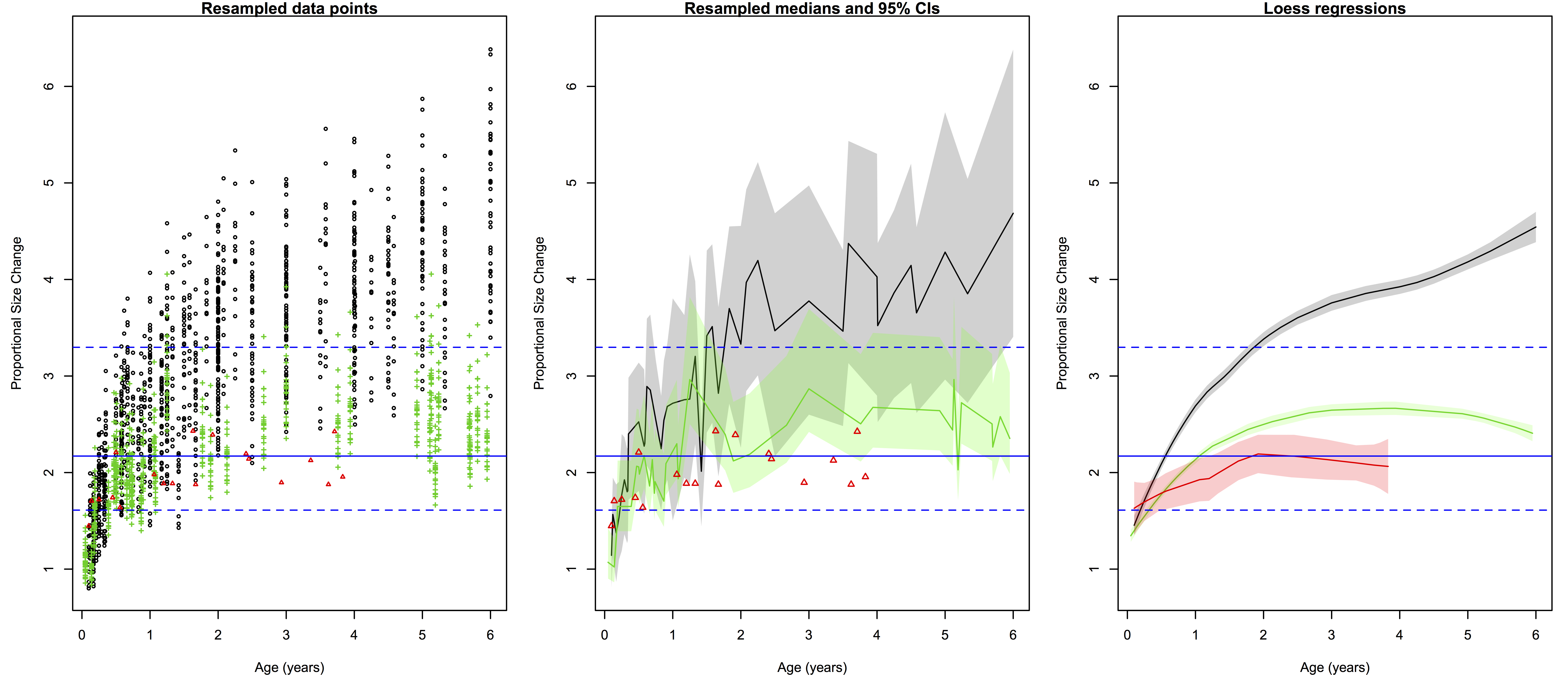
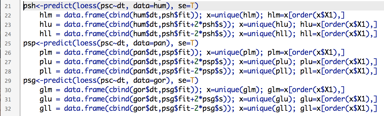
The lesson on functions and resampling was based on limb length data for apes, fossil hominins and modern humans (from Dr. Herman Pontzer). The csv file with the data can be downloaded from David’s website. R has lots of great built-in functions (see basic stats, above), and even if you’re looking to do something more than the basics, chances are you can find what you’re looking for in one of the myriad packages that researchers have developed and published over the years. But sometimes it’s necessary to write a function on your own, and with fossil samples you may find yourself needing to do resampling with a specific function or test statistic.

For example, you can ask whether a small sample of “anatomically modern” fossil humans (n=12) truly differs in femur length from a small sample of Neandertals (n=9). Traditional statistics require certain assumptions about the size and distribution of the data, which fossils fail to meet. Another way to ask the question is, “If the two groups come from the same distribution (e.g. population), would random samples of sizes n=12 and n=9 have so great an average difference as we see between the fossil samples?” A permutation test, shuffling the group membership of the fossils and then calculating the difference between the new “group” means, allows you to quickly and easily ask this question:

R code for a simple permutation test.

R code for a simple permutation test. The built-in function “sample()” is your best friend.

Although simply viewing the data suggests the two groups are different (boxplot on the left, below), the permutation test confirms that there is a very low probability of sampling so great a difference as is seen between the two fossil samples.

Left: Femur lengths of anatomically modern humans (AMH) and Neandertals. Right: distribution of resampled group differences. Dashed lines bracket 95% of the resampled distribution, and the red line is the observed difference between AMH and Neandertal femur lengths. Only about 1% of the resampled differences are as great as the observed fossil difference.

Left: Femur lengths of anatomically modern humans (AMH) and Neandertals. Right: distribution of resampled group differences. Dashed lines bracket 95% of the resampled distribution, and the red line is the observed difference between AMH and Neandertal femur lengths. Only about 1% of the resampled differences are as great as the observed fossil difference.

Here’s the code for the functions & resampling lesson. There are a bunch of examples of different resampling tests, way more than we possibly could’ve done in the brief time for the workshop. It’s posted here so you can wade through it yourself, it should keep you busy for a while if you’re new to R. Good luck!

A picture is worth a thousand datapoints in #rstats

I’m finally about to push my study of brain growth in H. erectus out of the gate, and one of the finishing touches was to make pretty pretty pictures. Recall from the last post on the subject that I was resampling pairs of specimens to compute how much proportional brain size change (PSC) occurred from birth a given age in humans and chimpanzees (and now gorillas). This resulted in lots of data points, which can be a bit difficult to read and interpret when plotted. Ah, cross-sectional data. “HOW?!” I asked, “HOW CAN I MAKE THIS MORE DIGESTIBLE?” Having nice and clean plots is useful regardless of what you study, so here I’ll outline some solutions to this problem. (If you want to figure this out for yourself, here are the raw resampled data. Save it as a .csv file and load it into R)

All

Ratios of proportional size change from birth to a later age. Black/gray=humans, green=chimpanzees, red=gorillas. Left are all 2000 resampled ratios, center shows the medians (solid lines) and 95% quantiles of the ratios for each species at a given age (the small gorilla sample is still data points), and right are the loess regression lines and (shaded) 95% confidence intervals. Blue lines across all three plots are the H. erectus median (solid) and 95% quantiles (dashed).

The left-most plot above shows the raw resampled ratios: you can see a lot of overlap between humans (black), chimpanzees (green) and gorillas (red). But all those points are a bit confusing: just how extensive is the overlap? What is the central tendency of each species?

The second plot shows a less noisy way of displaying the results. We can highlight the central tendencies by plotting PSC medians for each age (I used medians and not means since the data are not normally distributed), and rather than showing the full range of variation in PSC at each age, we can simply highlight the majority (95%) of the values.

To make such a plot in R, for each species you need four pieces of information, in vector form: 1) the unique (non-repeated) ages sorted from smallest to largest, and the 2) median, 3) upper 97.5% quantile, and 4) lower 0.025% quantile for each unique age. You can quickly and easily create these vectors using R‘s built-in commands:

R codes to create the vectors of points to be plotted in the second graph. Note that vectors are not created for gorillas because the sample size is too small, or for H. erectus because the distribution is basically the same across all ages.

R codes to create the vectors of points to be plotted in the second graph. Note that vectors are not created for gorillas because the sample size is too small, or for H. erectus because the distribution is basically the same across all ages.

With these simple vectors summarizing humans and chimpanzees variation across ages, you’re ready to plot. The medians (hpm and ppm in the code above) can simply be plotted against age using the plot() and lines() functions, simple enough. But the shaded-in 95% quantiles have to be made using the polygon() function, which creates a shape (a polygon) by connecting sets of points that have to be entered confusingly: two sets of x-coordinates with the first in normal order and the second reversed, and two sets of y-coordinates with the first in normal order and the second reversed.

Plot yourself down and have a beer.

Plot yourself down and have a beer.

In our case, the first set of x coordinates is the vector of sorted, unique ages (h and p in the code), and the second set is the same vector but in reverse. The first set of y coordinates is the vector of 97.5% quantiles (hpu and ppu), and the second set is the vector of 0.025% quantiles in reverse. You can play around with ranges of colors and transparency with “col=….”

What I like about the second plot is that it clearly summarizes the ranges of variation for humans and chimps, and highlights which parts of the ranges overlap: the human and ape medians are comparable at the youngest ages, but by 6 months the human median is pretty much always above the chimpanzee upper range. The gorilla points are generally close to the chimpanzee median until around 2 years after which gorilla size increase basically stops but chimpanzees continue. Importantly, we can also see at what ages the simulated H. erectus values are most similar to the empirical species values, and when they fall out of species’ ranges. As I pointed out a bajillion years ago, the H. erectus values (based on the Mojokerto juvenile fossil) encompass most living species’ values around six months to two years.

I also like that second plot does all the above, and still honestly shows the jagged messiness that comes with cross-sectional, resampled data. Of course no individual’s proportional brain size increases and decreases so haphazardly during growth as depicted in the plot. It’s ugly but it’s honest. But if you like lying to yourself about the nature of your data, if you prefer curvy, smoothed inference to harsh, gritty reality, you can resort to the third plot above: the loess regression lines calculated from the resampled data.

Loess and lowess (not to be confused with loess) refer to locally weighted regression scatterplot smoothing, a way to model gross data like we have, but with a nice and smooth (but not straight) line. Because R is awesome, it has a loess() function built right in. The function easily does the math, and you can quickly obtain confidence intervals for the modelled line, but plotting these is another story. After scouring the internet, coding and failing (repeatedly) I finally came up with this:

Screen Shot 2014-07-26 at 6.57.01 PM

Creating vectors of points makes your lines clean and smooth.

If you simply try to plot a loess() line based on 1000s of unordered points, you’ll get a harrowing spider’s web of lines between all the points. Instead, you need to create ordered vectors of the non-repeated modelled points (hlm, plm, glm, above) and their upper and lower confidence limits. Once modelled, you can simply plot the lines and create polygons based on the confidence intervals as above.

The best way to learn to do stuff in R is to just play around with data and code until you figure out how to do whatever it is you have in mind. If you want to recreate, or alter, what I’ve described here, you can download the resampled data (link at the beginning of the post) and R code. Good luck!

More FREE badass bioanthro science resources!

Hark! There’s been quite a long silence here, as I’ve been busy preparing manuscripts related to this post and this post. Also teaching; my new Intro to Biological Anthropology students are writing posts over at nazarbioanthro.blogspot.com – check them out!

Anyway, some more FREE DATA have come to my attention that I figured people may find useful (I’ve posted links to other great resources here and here).

First, my buddy and advisor Milford Wolpoff has helped compile an open online dental dataset. This consists of length and breadth measurements for teeth from humans, fossil humans and non-human apes. And promises of more to come! You can read about the data, and online data-sharing more generally, in this paper at the Paleoanthropology Society website.

Secondably, Herman Pontzer has put together a website, Australopithecus, with lots of great information about human evolution for teachers and students, as well as a datamine of links and metrics and pictures of fossil hominins and apes. Pretty boss.

Third, announced in the American Journal of Physical Anthropology just yesterday is a database of cranial non-metric data, pioneered by Nancy Ossenberg. This is a very comprehensive dataset, with info about up to 84 non-metric traits on over 8,000 individual crania from all over the world. Ossenberg also links to the WW Howells craniometric dataset (thousands of cranial measurements of individuals all over dodge); I’m not sure if/how much Ossenberg’s and Howells’ datsets overlap, but the covariance of size, shape and non-metric traits could be a very interesting investigation (if it hasn’t been done already; sorry for my ignorance!).

Finally, if you’re looking to analyze these or any other tantalizing data, you’ll want to download and learn to use R. This free statistical computing program will let you analyze pretty much anything with either traditional statistics, or you can be a badass and make up your own custom tests. I’ve been blabbing incessantly about how awesome this program is since at least 2009, but here’s the link just in case. takes some time to figure out how to use, but its help files are all online, and you can probably find out how to do anything else your dreams can concoct on the Internets.

Now you are ready to take on the world. Go forth!

The beardless White House: Part I

Something’s been bothering me about this election. No, it’s not the silence from both major parties on climate change. It’s the fact that neither Obama nor Romney (I accidentally just typed “RMoney”… accidentally?) sports facial hair. A friend and I were talking about this the other day, and a quick google search showed us there hasn’t been an appreciable furface sleeping at 1600 Pennsylvania Ave. since the mustachioed WH Taft (of butter and bathtub fame), 100 years ago. That is, unless any of these recent presidents was a closet homosexual (different meaning of “beard”).

This is hairy dearth is deplorable. Just look at this pic of portraits of past presidents:

You’re probably thinking, “Where’s all the virile scruff?” Well, no, you’re probably thinking, “There’s a lot of dudes / white ppl there.” But your next thought is probably, “Where’s all the virile scruff?” However, from Abe Lincoln through Bill Taft there’s a fairly flagrant concentration of beards, mustaches and whatever you call the thing hiding Chester A. Arthur’s charming smile (squared off in red); only W McKinley and A Johnson dared rain on this badass parade. Yes, there are some audacious sideburns on John Q. Adams and Martin Van Buren, but otherwise all Executive facial hair is concentrated between 1860 and 1913. What gives?

It looks like there’s a fairly clear pattern: voters loathed and distrusted facial hair for the first nearly 100 years of American history, followed by a brief period in which facial hair was loved and trusted, which may then have been ruined by Taft and after which there’s been nary a stache nor goat sitting in the oval office to the present day. Is this a real pattern, or could some other random process produce this same distribution of scruff? (for simplicity’s sake, we’ll pretend no president served more than 1 term…) Could random sampling of 43 (mostly white) men give us a clump of 9/13 with facial hair? (side burns don’t count) If there’s a 50/50 chance of a man growing facial hair, is 9/43 Prezes unusually high or low? I’ll let you know after I write and run some tests!

You may have my statistical codes

As I’ve been working on my dissertation, I’ve had to come up with some new ways to compare (cross-sectional) growth in crappy fossil samples with a larger reference population. I’ve coded a procedure in the R statistical program that uses resampling to test whether two groups differ in the amount of size change experienced between various different ages (i.e. growth). This code is now available on my website.**

And how timely – a commentary in this week’s issue of Nature demands that researchers publish the codes used in their analyses (Ince et al. 2012). After all, what good is Science if it’s not reproducible? (Admittedly, the commentary is geared toward more intense, data-generating programs than anything I’ve written, which is mathematically very simple and generally comprises less than 100 lines of code. Nevertheless.)

ResearchBlogging.orgAnyone is free to use or adapt the code, with the caveat that one must have at least a little experience using R. In many ways the procedure is similar to a method called Euclidean Distance Matrix Analysis (EDMA; Lele and Richtsmeier 1991), although unlike EDMA my program centers around the problem of making comparisons in the face of lots of missing data. And lots of fun!

**  Oh crap! I just remembered I also posted a simple resampling procedure here on Lawnchair two and a half years ago. Where does the time go…

Some inspiration
Ince, D., Hatton, L., & Graham-Cumming, J. (2012). The case for open computer programs Nature, 482 (7386), 485-488 DOI: 10.1038/nature10836

Lele, S., & Richtsmeier, J. (1991). Euclidean distance matrix analysis: A coordinate-free approach for comparing biological shapes using landmark data American Journal of Physical Anthropology, 86 (3), 415-427 DOI: 10.1002/ajpa.1330860307

Stimulating the drunk on the platform

Gotcha! I mean “simulating” in the title, not “stimulating.” This one’s about programming.

I’m interested, for various reasons, in how evolution might bring about change over time. Recall from my Evolution Overview that evolutionary changes could occur by drift or natural selection. Drift means random change, because a given polymorphism has no effect on fitness. Natural selection, on the other hand, is what my advisor likes to call the 900-lb gorilla: it does whatever the eff it wants. Selection can take existing variation in a population and mold it into all kinds of oddities. Within Primates, natural selection has fashioned inquisitive apes that walk on two legs and go to the moon, and sexual selection has festooned male mandrills in variegated visage (right). Selection can be gentle and allow gradual change (what I like to call sensual selection), or it could be strong and cause rapid change.
Selection can seem random for various reasons (e.g. why is it acting as intensely as it does when it does?), so it is hard to tell whether a given evolutionary scenario can be explained by selection for a given behavior, or if it reflects totally random change (drift).
Monte Carlo statistical methods allow one to simulate a given scenario, to test competing hypotheses. A simple null hypothesis that can be simulated is drift – change is completely random in direction, and if I reject this hypothesis I could argue that an alternative explanation (selection) is appropriate

The random walk is the oft-used analogy for this null hypothesis of random change. Now, if I’d ever been so imperfect as to have succumbed to the siren-song of spirits, maybe I’d corroborate the analogy. But using the extent of your limited but unadulterated imagination, pretend there is a drunk kid who happened to go to Loyola Chicago (like myself), and who walks onto the L platform (like I often did; left, looking north from the Lawrence Red Line stop). As booze takes the reins, he stumbles randomly between the edges of the train platform. This random walk down the train platform could result in the drunkard making it safely to the end, or he could fall off either side to a gruesome doom awaiting on the tracks below.

Thinking about limb proportions, and how to program this hypothesis/scenario, I stumbled upon the useful cumsum() function for the R statistical program. This function allows me to indicate how much change to occur for how many steps (i.e. generations), thus effectively simulating the random walk. For example (right), say I want to ask if the tibia (shin bone) gets long relative to the femur (thigh bone) in human evolution, because of drift vs. natural selection. I start with a given proportion of [tibia/femur] and simulate change in a random direction in tibia and femur length, over a quarter million years (or 18,000 15-year generations).

The figure is a bird’s eye view of a random walk: at each generation the drunken tibia/femur ratio steps forward (to the right in the picture) and randomly right or left (toward the top or bottom of the picture). This took literally 2 seconds to program and graph. The dashed black line represents the relative tibia/femur relationship at the beginning of the evolutionary sequence, and the red line is the ratio 250,000 years (18,000 generations) later. Note that in this particular random scenario, not only is the final tibia/femur ratio exactly that observed, but that over the time span this ratio was reached about 20 different times. Do this randomization 500 or more times to see how often random change will result in the observed difference between time periods. Assuming the simulations realistically model reality, the observed change in limb proportions could easily be explained by drift (i.e. climate or efficiency adaptations did not have so strong a selective advantage as to be detected by this test). That is, the change in proportions could have been effected by random change or by weak directional selection.
I’m currently looking for any ways to make the model more realistic, for example:
  1. how much evolution (e.g. change) could occur per generation. Currently, each generation changes by plus or minus a given maximum. I would like to be able to simulate any amount of change between zero and an a priori maximum.
  2. it’s easier to let the tibia and femur change randomly with respect to one another. However, this is unrealistic because the thigh and leg are serially homologous, their variation is not independent of one another. I would like to model each element’s change per generation to reflect this covariance.
Anyway, I’ve only begun looking into the topic of how to analyze evolutionary change, but it looks like testing evolutionary hypotheses might not be impossible?