As I mentioned a few weeks ago, some colleagues and I have recently published an article about brain structure and function of the fossil hominin Homo naledi, based on endocranial evidence. Ben Taub wrote up a nice summary of the paper for IFL Science that lays out some of the main points and bigger picture (here). The article is open access for everyone to read (here), as are the new landmark data and R code (here) that we used to reconstruct and analyze the endocast of the most complete H. naledi skull.
Over the past decade it has become standard practice to publish data and code, to both facilitate transparency and allow others to add to existing datasets. It turns out it’s also important when journals don’t include your high-resolution figures in the final publication and are incapable of replacing the low quality images that made it into print (makes you wonder just what the $5000 article processing charge pays for). So, this is a good opportunity to follow up on the earlier blog post and walk you through the R code that produces the graphs (along with a few other images) that help illustrate the story told by H. naledi endocasts.
Homo naledi is one of the wildest discoveries in human evolution, from its unusual geological contexts to the variability exhibited in the large subfossil sample. The endocasts are tantalizing, since they are as small as those of hominins from over one million years ago, yet they date to only around 300,000 years ago. They buck the general trend of brains getting bigger of the course of human evolution.
Unlike the other small-brained, later Pleistocene hominin Homo floresiensis (a.k.a., “the hobbit”), there is a nice and big sample of H. naledi crania. The floresiensis sample is restricted to a relatively complete skeleton from one individual (“LB1”) and a few other bones from several other individuals. The small brain size of LB1 precipitated a series of studies in the early 2000s, arguing for (or against) various pathological explanations, though I think the consensus today is that H. floresiensis was in fact a small-brained hominin. It probably blew the minds of our human ancestors when they encountered hobbits on Flores 10s of 1000s of years ago. In contrast to the case of H. floresiensis, at least five adult H. naledi crania have been recovered from Rising Star Cave in South Africa, all indicating brain sizes between 460–610 ml.
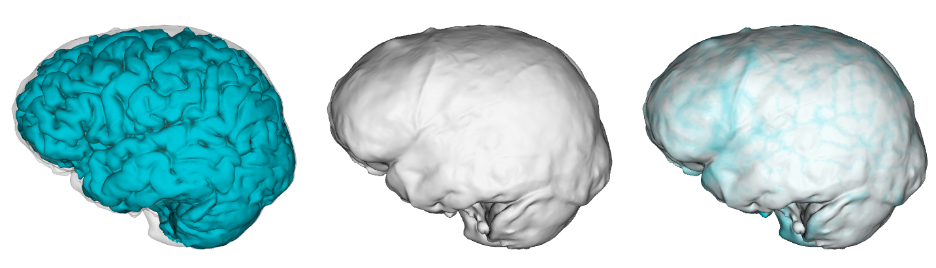
Despite having small brains, the impressions from the frontal lobe suggest this part of the brain was organized like that of humans today. This is important in part because this specific region including Brodmann Areas 44-45 (highlighted in blue below) is involved in both spoken language as well as stone tool production. In addition, these naledi endocasts support to the idea, proposed over 100 years ago, that early hominin brains may have been structured like those of modern humans but at smaller sizes.
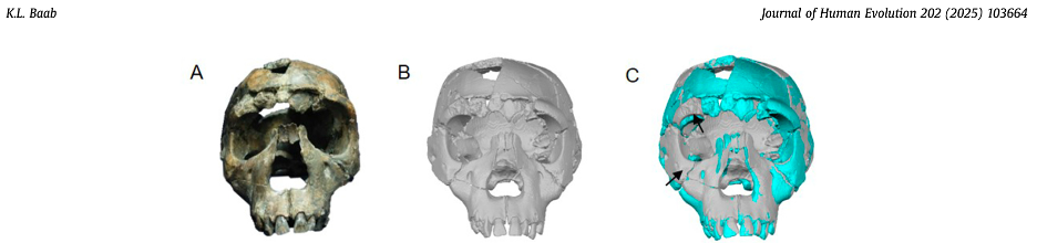
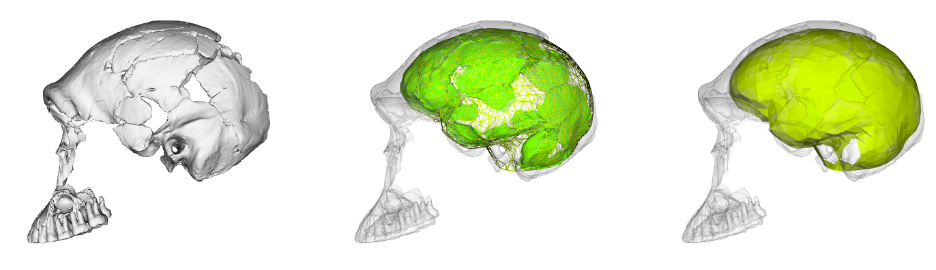
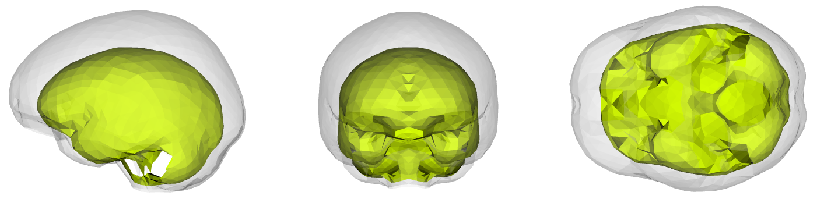
To learn more about the brain of H. naledi, we virtually reconstructed the endocast of the sample’s most complete skull, referred to as “LES1” (the first hominin from the Lesedi Chamber of Rising Star Cave). The R code linked above uses geometric morphometrics to estimate the likely positions of endocranial surfaces that are missing from the actual LES1 fossil. When reconstructing a fossil from fragments, we can rarely know what the original bone truly looked like when it was intact. But with geometric morphometrics, we can estimate missing data based on different references (e.g., a specific Homo erectus fossil or a sample average), allowing us to explore many reasonable alternatives. So, the R code generates 15 reconstructions of the LES1 endocast based on over a dozen fossil hominin references (previously published by Simon Neubauer and colleagues).
Although LES1 is missing nearly all of the bottom of the skull and endocast, all of our reconstructions based on various fossils and an average human are quite similar to one another. In geometric morphometrics, a shape is captured by a configuration of landmarks—in our case, 935 coordinates in 3D space. The Procrustes distance provides a quick summary of the overall shape difference between two individuals (for instance, two different reconstructions of LES1). The R code includes a simple function for calculating pairwise Procrustes distances, and then uses randomization and loops to obtain Procrustes distances between all LES1 reconstructions, between all humans, between all Homo erectus included in the study, and between the average LES1 and all other fossils.
In the left graph above, the pink dots show the shape differences between all LES1 reconstructions: these differences are smaller than all the within-erectus differences and nearly all of the within-human differences. This means that most of the reconstructions are more similar to one another than two different individuals of the same species would be to one another. This in turn means that missing data uncertainty is fairly low for LES1; if we were to run various analyses, the results should be pretty much the same regardless of which LES1 reconstruction we use. Great! (As an aside, we had also estimated the endocranial volumes of each LES1 reconstruction and these ranged from 608–622 ml, a precise span very similar to the first estimate of 610 ml when the fossil was first discovered. But we ended up cutting this from the paper.)
Looking at the same graph, Procrustes distances between LES1 and most of the other fossils are comparable to the within-species variation seen in humans and H. erectus. These distances, along with the cluster analysis in the right side of the image above, show that the LES1 endocast shape is most similar to those of H. erectus from Java (Ngandong, Ngawi, Sambungmacan).
This was an unexpected result. The skull and teeth of H. naledi have been shown to be more similar to earlier members of the genus Homo, but the LES1 endocast doesn’t show this affinity. Plus, these later H. erectus endocasts are almost twice the size of LES1, yet LES1 doesn’t appear to be a simply a H. erectus ‘scaled down’ to a smaller size. The Procrustes distances and cluster analysis highlight overall endocast shape variation in the sample, so the R code then goes on to look at the more detailed differences between LES1 and each fossil reference group. In the next image, the top row compares the scaled and aligned endocasts of LES1 and given reference, while the bottom row color-codes the difference between each 3D coordinate on LES1 and the reference endocast.
Notice that the inferior frontal lobe appears relatively expanded in LES1 compared to all of the other groups. This corroborates previous research indicating a human-like anatomy in this area that is important for language and tool production. We speculate that the almost-human morphology here (recall the third image in this post) may relate to how different parts of the brain are connected, but much more research is needed to develop this idea.
The last aspect of endocast shape that we examined is the proportional size of the areas surrounding the cerebral cortex versus the cerebellum. The bottom of the cerebellum is cupped by the occipital and temporal bones (dark pink in the image below), while the top and sides of the cerebral cortex are capped by the rest of the endocranial surface (lighter pink below). We can quickly measure the overall sizes of these two brainy coverings based on their 3D landmarks, but we should bear in mind these are only approximations of the cerebrum and cerebellum themselves. The graph below shows how these proxies scale within the sample, with a best-fit line showing the relationship in recent humans. All of the fossil hominins including naledi have relatively smaller cerebella than modern humans, which might suggest a disproportionate expansion of the cerebral cortex later in human evolution.
Size scaling of the bony surfaces covering the cerebral cortex (light pink landmarks) and cerebellum (dark pink landmarks).
In our review of the brain of H. naledi we presented some new data and evidence, and also tried to point toward important areas for future research. These include exploring physical influences on brain/endocast shape—both intrinsically due to connections between different regions of the brain, and extrinsically due to how the eyes, nose, throat, and jaws interact with the brain during growth and development. Bigger samples of both fossils and living apes would also help uncover how the cerebellum has changed over time.
This latter project is ripe for the picking. The shape analyses we presented in the paper basically just entailed creating and applying a 3D landmark template to LES1, and inserting LES1 into an existing dataset. Recall from another recent blog post that second research group, led by Marcia Ponce de León and Christoph Zollikofer, has also published their similar endocast landmark data and provides a much larger fossil and ape sample. It wouldn’t take too much work to create and apply a landmark template from this sample to LES1 and do all the same analyses (and more) that we included in our open access article and code. And because the H. naledi fossils themselves are available for study (originals at the University of the Witwatersrand, and so many 3D models on Morphosource), a more comprehensive analysis of all H. naledi endocasts is well within reach.
So many fossils, so little time!