A picture is worth a thousand datapoints in #rstats

I’m finally about to push my study of brain growth in H. erectus out of the gate, and one of the finishing touches was to make pretty pretty pictures. Recall from the last post on the subject that I was resampling pairs of individual brain sizes to compute how much proportional brain size change (PSC) occurred from birth a given age in humans and chimpanzees (and now gorillas). This resulted in lots of data points, which can be a bit difficult to read and interpret when plotted. Ah, cross-sectional data. “HOW?!” I asked, “HOW CAN I MAKE THIS MORE DIGESTIBLE?” Having nice and clean plots is useful regardless of what you study, so here I’ll outline some solutions to this problem. (If you want to figure this out for yourself, here are the raw resampled data. Save it as a .csv file and load it into R)
All

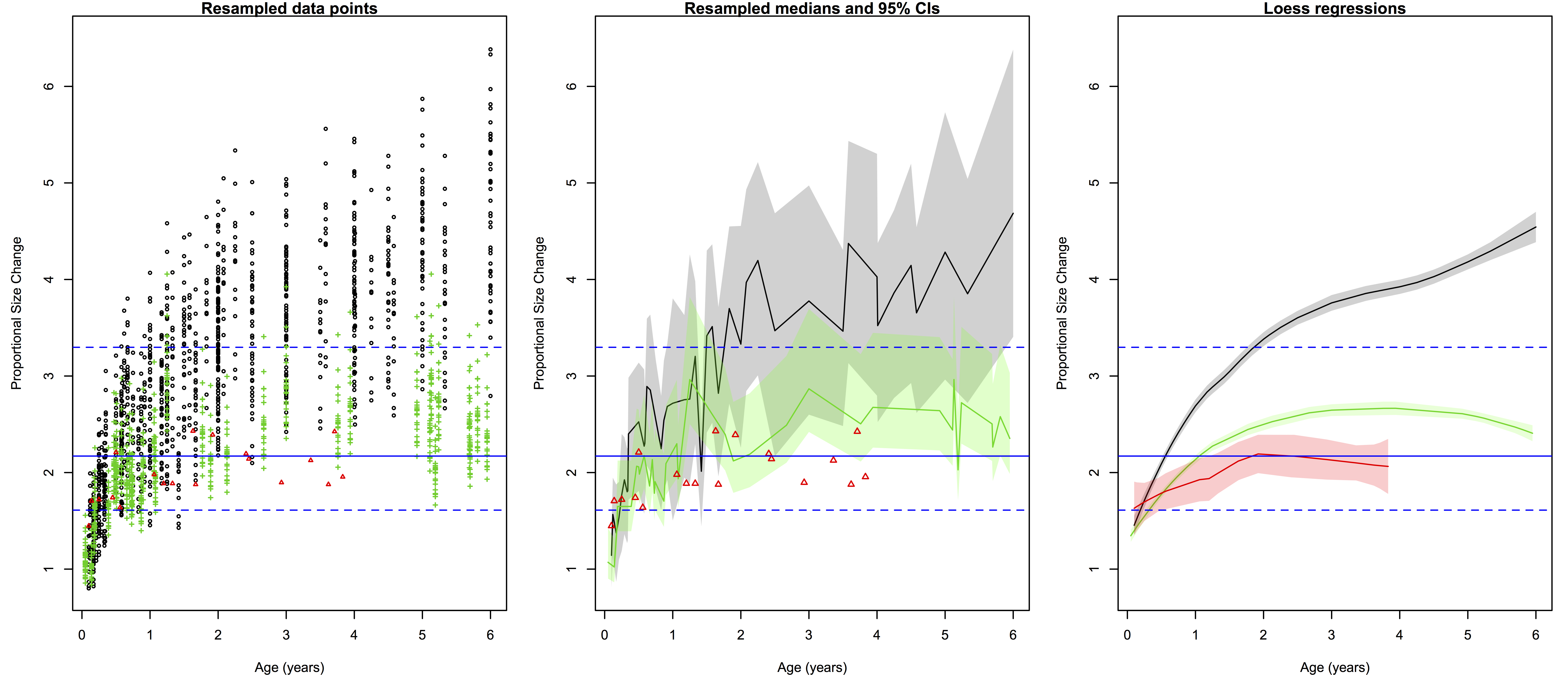
Ratios of proportional size change from birth to a later age. Black/gray=humans, green=chimpanzees, red=gorillas. Left are all 2000 resampled ratios, center shows the medians (solid lines) and 95% quantiles of the ratios for each species at a given age (the small gorilla sample is still data points), and right are the loess regression lines and (shaded) 95% confidence intervals. Blue lines across all three plots are the H. erectus median (solid) and 95% quantiles (dashed).

The left-most plot above shows the raw resampled ratios: you can see a lot of overlap between humans (black), chimpanzees (green) and gorillas (red). But all those points are a bit confusing: just how extensive is the overlap? What is the central tendency of each species?

The second plot shows a less noisy way of displaying the results. We can highlight the central tendencies by plotting PSC medians for each age (I used medians and not means since the data are not normally distributed), and rather than showing the full range of variation in PSC at each age, we can simply highlight the majority (95%) of the values.

To make such a plot in R, for each species you need four pieces of information, in vector form: 1) the unique (non-repeated) ages sorted from smallest to largest, and the 2) median, 3) upper 97.5% quantile, and 4) lower 0.025% quantile for each unique age. You can quickly and easily create these vectors using R‘s built-in commands:

R codes to create the vectors of points to be plotted in the second graph. Note that vectors are not created for gorillas because the sample size is too small, or for H. erectus because the distribution is basically the same across all ages.

R codes to create the vectors of points to be plotted in the second graph. Note that vectors are not created for gorillas because the sample size is too small, or for H. erectus because the distribution is basically the same across all ages.

With these simple vectors summarizing humans and chimpanzees variation across ages, you’re ready to plot. The medians (hpm and ppm in the code above) can simply be plotted against age using the plot() and lines() functions, simple enough. But the shaded-in 95% quantiles have to be made using the polygon() function, which creates a shape (a polygon) by connecting sets of points that have to be entered confusingly: two sets of x-coordinates with the first in normal order and the second reversed, and two sets of y-coordinates with the first in normal order and the second reversed.

Plot yourself down and have a beer.

Plot yourself down and have a beer.

In our case, the first set of x coordinates is the vector of sorted, unique ages (h and p in the code), and the second set is the same vector but in reverse. The first set of y coordinates is the vector of 97.5% quantiles (hpu and ppu), and the second set is the vector of 0.025% quantiles in reverse. You can play around with ranges of colors and transparency with “col=….”

What I like about the second plot is that it clearly summarizes the ranges of variation for humans and chimps, and highlights which parts of the ranges overlap: the human and ape medians are comparable at the youngest ages, but by 6 months the human median is pretty much always above the chimpanzee upper range. The gorilla points are generally close to the chimpanzee median until around 2 years after which gorilla size increase basically stops but chimpanzees continue. Importantly, we can also see at what ages the simulated H. erectus values are most similar to the empirical species values, and when they fall out of species’ ranges. As I pointed out a bajillion years ago, the H. erectus values (based on the Mojokerto juvenile fossil) encompass most living species’ values around six months to two years.

I also like that second plot does all the above, and still honestly shows the jagged messiness that comes with cross-sectional, resampled data. Of course no individual’s proportional brain size increases and decreases so haphazardly during growth as depicted in the plot. It’s ugly but it’s honest. But if you like lying to yourself about the nature of your data, if you prefer curvy, smoothed inference to harsh, gritty reality, you can resort to the third plot above: the loess regression lines calculated from the resampled data.

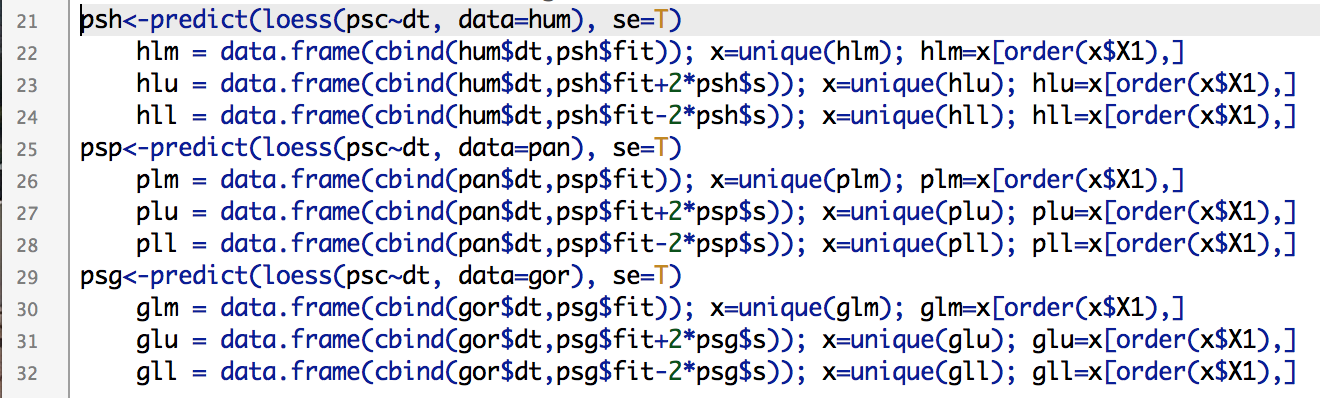
Loess and lowess (not to be confused with loess) refer to locally weighted regression scatterplot smoothing, a way to model gross data like we have, but with a nice and smooth (but not straight) line. Because R is awesome, it has a loess() function built right in. The function easily does the math, and you can quickly obtain confidence intervals for the modelled line, but plotting these is another story. After scouring the internet, coding and failing (repeatedly) I finally came up with this:
Screen Shot 2014-07-26 at 6.57.01 PM

Creating vectors of points makes your lines clean and smooth.

If you simply try to plot a loess() line based on 1000s of unordered points, you’ll get a harrowing spider’s web of lines between all the points. Instead, you need to create ordered vectors of the non-repeated modelled points (hlm, plm, glm, above) and their upper and lower confidence limits. Once modelled, you can simply plot the lines and create polygons based on the confidence intervals as above.

The best way to learn to do stuff in R is to just play around with data and code until you figure out how to do whatever it is you have in mind. If you want to recreate, or alter, what I’ve described here, you can download the resampled data (link at the beginning of the post) and R code. Good luck!

Ima Gona follow up on that last post

Last week, I discussed the implications of the Gona hominin pelvis for body size and body size variation in Homo erectus. One of the bajillion things I have been working on since this post is elaborating on this analysis to write up, so stay tuned for more developments!

Now, when we compared the gross size of the hip joint between fossil Homo and living apes (based on the femur head in most specimens but the acetabulum in Gona and a few other fossils), the range of variation in Homo-including-Gona was generally elevated above variation seen in all living great apes. This is impressive, since orangutans and gorillas show a great range of variation due sexual dimorphism (normal differences between females and males). However, I noted that the specimens I used were unsexed, and so the resampling strategy used to quantify variation within a species – randomly selecting two specimens and taking the ratio of the larger to smaller – probably underestimated sexual dimorphism.

Shortly after I posted this, Dr. Herman Pontzer twitterated me to point out he has made lots of skeletal data freely available on his website (a tremendous resource). The ape and human data I used for last week’s post did not have sexes (my colleague has since sent me that information), but Pontzer’s data are sexed (no, not “sext“). So, I modified and reran the original resampling analysis using the Pontzer data, and it nicely illustrates the difference between using a max/min vs. male/female ratio to compare variation:

Hip joint size variation in living African apes (left and right) compared with fossil humans (genus Homo older than 1 mya, center). Each plot is scaled to show the same y-axis range. On the left are ratios of max/min from resampled pairs from each species (sex not taken into account). On the right are ratios of male/female from resampled pairs from each species. The red dots on this plot are the medians for max/min ratios (the thick black bars in the left plot). The center plot shows ratios of Homo/Gona.

Hip joint size variation in living African apes (left and right) compared with fossil humans (genus Homo older than 1 mya, center). Each plot is scaled to show the same y-axis range. On the left are ratios of max/min from resampled pairs from each species (sex not taken into account). On the right are ratios of male/female from resampled pairs from each species. The red stars on this plot are the medians for max/min ratios (the thick black bars in the left plot). The center plot shows ratios of Homo/Gona.

The left plot shows resampled ratios of max/min in humans, chimpanzees and gorillas, while the right shows ratios of male/female in these species. If no assumption is made about a specimen’s sex (left plot), it is possible to resample a pair of the same sex, and so it is likelier to sample two individuals similar in size. Note that the ratio of max/min can never be less than 1. However, if sex is taken into account (right plot), we see two key differences. First, because of size overlap between males and females in humans and chimpanzees, ratios can fall below 1. Adult gorilla males are much larger than females, and so the ratio is never as low as 1 (minimum=1.08). Second, in more dimorphic species, the male/female ratio is elevated above the max/min ratio (red stars in the right plot). In chimpanzees, the median male/female ratio is actually just barely lower than the median max/min ratio. If you want numbers: the median max/min ratios for humans, chimpanzees and gorillas are 1.09, 1.06 and 1.16, respectively. The corresponding median male/female ratios are 1.15, 1.06 and 1.25.

Regarding the fossils, if we assume that Gona is female and all other ≥1 mya Homo hips are male, the range of hip size variation can be found within the gorilla range, and less often in the human range.

But the story doesn’t end here. One thing I’ve considered for the full analysis (and as Pontzer also pointed out on Twitter) is that the relationship between hip joint size and body weight is not the same between humans and apes. As bipeds, we humans place all our upper body weight on our hips; apes aren’t bipedal and so relatively less of their weight is transmitted through this joint. As a result, human hip joint size increases faster with increasing body mass than it does in apes.

So for next installment in this fossil saga, I’ll consider body mass variation estimated from hip joint size. Based on known hip-body size relationships in humans vs. apes, we can predict that male/female variation in humans and fossil hominins will be relatively higher than the ratios presented here – will this put fossil Homo-includng-Gona outside the gorilla range of variation? Stay tuned to find out!

Friday excitement: Panoramic data inspection

I teach Tuesdays and Thursdays this year, leaving Fridays welcomely wide open for non-teaching related productivity. Today’s task is arguably the most exhilarating aspect of doing Science – inspecting raw data to make sure there are no major errors or problems in the dataset, so I can then analyze it and change the world. The excitement is truly hard to contain.

Delectable dog food is the dataset; I’m the dog.

No, it’s not the funnest, but it’s an important part of doing Science. To make your life easier, you should inspect data daily as you collect them. This way, you can identify mistakes and make notes about outliers early on, so that you are not stupefied and stalemated by what you see when you sit down to begin analysis.

You (corgi) are getting ready to analyze and you find an anomalous observation (door stop) you didn’t notice when you were collecting data.

Today I’m looking at measurements I took from ape mandibles housed in an English museum last summer; I inspected data before I left the UK for KZ, so today should be a breeze. But no matter how meticulous you are in the field/museum, you still need to inspect your data before analyzing them, just to be safe. If you’re as disorganized as I am, there will be lots of programs each with lots of windows. Here’s a tip: plug into multiple monitors (or at least one big ass monitor), so you can easily espy all open windows and programs in prodigious panorama.

Using two monitors helps when checking data for errors and patterns

Using two monitors helps when checking data for errors and patterns. On my left screen I’m using R to visualize and examine the raw data open in Excel on the right screen. If something seems off on the left screen, I can quickly consult the original spreadsheet on the right.

Barely visible in the above screenshot, these are chimpanzee (red) and gorilla (black) mandible measurements plotted against a measure of body size, preliminarily described in this post from last August. I’m looking at whether any mandibular measurements track body size across the subadult growth period, in hopes that bodily growth can be studied in fossil species samples dominated by kid jaws. As you can (barely) see, some jaw measurements correlate with body size better than others, and sometimes the apes follow similar patterns but other times they don’t.

The data look good, so now I can go on to examine relationships between mandible and body size in more detail. Stay tuned for results!

More FREE badass bioanthro science resources!

Hark! There’s been quite a long silence here, as I’ve been busy preparing manuscripts related to this post and this post. Also teaching; my new Intro to Biological Anthropology students are writing posts over at nazarbioanthro.blogspot.com – check them out!

Anyway, some more FREE DATA have come to my attention that I figured people may find useful (I’ve posted links to other great resources here and here).

First, my buddy and advisor Milford Wolpoff has helped compile an open online dental dataset. This consists of length and breadth measurements for teeth from humans, fossil humans and non-human apes. And promises of more to come! You can read about the data, and online data-sharing more generally, in this paper at the Paleoanthropology Society website.

Secondably, Herman Pontzer has put together a website, Australopithecus, with lots of great information about human evolution for teachers and students, as well as a datamine of links and metrics and pictures of fossil hominins and apes. Pretty boss.

Third, announced in the American Journal of Physical Anthropology just yesterday is a database of cranial non-metric data, pioneered by Nancy Ossenberg. This is a very comprehensive dataset, with info about up to 84 non-metric traits on over 8,000 individual crania from all over the world. Ossenberg also links to the WW Howells craniometric dataset (thousands of cranial measurements of individuals all over dodge); I’m not sure if/how much Ossenberg’s and Howells’ datsets overlap, but the covariance of size, shape and non-metric traits could be a very interesting investigation (if it hasn’t been done already; sorry for my ignorance!).

Finally, if you’re looking to analyze these or any other tantalizing data, you’ll want to download and learn to use R. This free statistical computing program will let you analyze pretty much anything with either traditional statistics, or you can be a badass and make up your own custom tests. I’ve been blabbing incessantly about how awesome this program is since at least 2009, but here’s the link just in case. takes some time to figure out how to use, but its help files are all online, and you can probably find out how to do anything else your dreams can concoct on the Internets.

Now you are ready to take on the world. Go forth!

One more great bioanthro resource

Following up on yesterday’s post containing links to various online data and resources, Dr. Rebecca Jabbour brought the Human Origins Database to my attention today. As stated on the database’s home page:

Currently the Human Origins Database contains the measurements and skeletal element information present in the Koobi Fora Research Project. Volume 4: Hominid Cranial Remains by Bernard Wood (1991). In addition, a complete inventory of skeletal elements present for the chimpanzee and gorilla collections at the Powell-Cotton Museum is included, along with annotated data sheets providing information on epiphyseal fusion, element condition, etc.

Here’s a taste of the Powell-Cotton chimpanzee catalog & maturation info:

You have to register to access the database – which you should do since it’s free and appears immensely useful. Enjoy!

Online skeletal and dental datasets (links links links!)

The TM 1517a fossil, from here

Jean Jacques Hublin has a commentary [1] in the current issue of Nature, about making fossils available for scanning, digital replication, and ultimately hopefully open dissemination. As Hublin points out, it’s a bit ridiculous that a fossil is a rare enough thing as it is, but even after their discovery, fossils “can become unreachable relics once they are in storage.” Fortunately, Hublin goes on to point to online collections that are available to anyone interested. Somewhat ironically, the article about free-ish data is behind a paywall, so here are the resources Hublin describes:

  • The Ditsong CT Archive, created by the collaboration of Hublin’s group at Max Planck and the Ditsong (formerly Transvaal) Museum in South Africa, which contains digitized hominin fossils from the site of Kromdraai (see also [ref 2]). Check out the type specimen of Paranthropus robustus, from this site, above!
  • You can download CT scans of the Skhul V early human fossil, thanks to the Harvard Peabody Museum.
  • Wanna see the the oldest possible animal embryos, early humans, insects, and other crazy fossils? Check out the European Synchrotron Radiation Facility’s microCT database.
  • Get free CT scans of 2 human skulls, thanks to the Virtual Anthropology program at the University of Vienna.
  • Finally, the NESPOS initiative is a large repository of Pleistocene hominin fossil scans, which I somehow don’t know enough about.

In addition to these sources, here are 2 other datasets that are pretty badass:

ResearchBlogging.orgI haven’t had much opportunity to look into these datasets Hublin pointed out, but they look promising. If you know of other good resources, please do share!

References
[1] Hublin, J. (2013). Palaeontology: Free digital scans of human fossils Nature, 497 (7448), 183-183 DOI: 10.1038/497183a

[2] Skinner MM, Kivell TL, Potze S, & Hublin JJ (2013). Microtomographic archive of fossil hominin specimens from Kromdraai B, South Africa. Journal of human evolution, 64 (5), 434-47 PMID: 23541384