For last week’s AAPA conference, my friend and colleague David Pappano organized a workshop teaching about the many uses of the R programming language for biological anthropology (I’m listed as co-organizer, but really David did everything). After introducing the basics, we broke into small groups focusing on specific aspects of using R. I devised some lessons for basic statistics, writing functions, and resampling. Since each of the lessons could have easily taken up an hour and most people didn’t get to go through the activities fully, I’m posting up the R codes here for people to mess around with.
The basic stats lesson utilized Francis Galton’s height data for hundreds of families, courtesy of Dr. Ryan Raaum. To load in these data you just need to type into R: galton = read.csv(url(“http://bit.ly/galtondata“)). The code simply shows how to do basic statistics that are built into R, such as t-test and linear regression.
Some summary stats for the Galton data. The code is in blue and the output in black.
The lesson on functions and resampling was based on limb length data for apes, fossil hominins and modern humans (from Dr. Herman Pontzer). The csv file with the data can be downloaded from David’s website. R has lots of great built-in functions (see basic stats, above), and even if you’re looking to do something more than the basics, chances are you can find what you’re looking for in one of the myriad packages that researchers have developed and published over the years. But sometimes it’s necessary to write a function on your own, and with fossil samples you may find yourself needing to do resampling with a specific function or test statistic.
For example, you can ask whether a small sample of “anatomically modern” fossil humans (n=12) truly differs in femur length from a small sample of Neandertals (n=9). Traditional statistics require certain assumptions about the size and distribution of the data, which fossils fail to meet. Another way to ask the question is, “If the two groups come from the same distribution (e.g. population), would random samples of sizes n=12 and n=9 have so great an average difference as we see between the fossil samples?” A permutation test, shuffling the group membership of the fossils and then calculating the difference between the new “group” means, allows you to quickly and easily ask this question:
R code for a simple permutation test. The built-in function “sample()” is your best friend.
Although simply viewing the data suggests the two groups are different (boxplot on the left, below), the permutation test confirms that there is a very low probability of sampling so great a difference as is seen between the two fossil samples.
Left: Femur lengths of anatomically modern humans (AMH) and Neandertals. Right: distribution of resampled group differences. Dashed lines bracket 95% of the resampled distribution, and the red line is the observed difference between AMH and Neandertal femur lengths. Only about 1% of the resampled differences are as great as the observed fossil difference.
Here’s the code for the functions & resampling lesson. There are a bunch of examples of different resampling tests, way more than we possibly could’ve done in the brief time for the workshop. It’s posted here so you can wade through it yourself, it should keep you busy for a while if you’re new to R. Good luck!
The 85th annual meeting of the American Association of Physical Anthropologists, in Hottlanta this year, is only a few short weeks away. The preliminary program is up, and there’s really a lot to look forward to at this year’s conference. There’s a session dedicated to Homo naledi on Saturday morning (16 April), and I’ll be presenting on dental development in Homo naledi at the very end of the last session of the day. Leading up to the conference, I’ll be tweeting teasers as I put together my talk.
My colleague David Pappano and I are also organizing a workshop on using R in biological anthropology, which will take place on Friday 15 April from 9:30-11:30 am. The goal of the workshop isn’t to make you an expert in R by the end of the two short hours, but rather to introduce you to the basic functions and potential uses of the powerful, free statistical software. So if you’Re Ready to leaRn some R basics, come to Room A601 on FRiday moRning – it’s fRee and no RegistRation is RequiRed.
Hopefully we’ll see you in Atlanta in a few weeks!
Holy crap 2015 was a big year for fossils. And how fortuitous that 2016 begins on a Fossil Friday – let’s recap some of last year’s major discoveries.
Homo naledi
Some Homo naledi mandibles in order from least to most worn teeth.
The Homo naledi sample is a paleoanthropologist’s dream – a new member of the genus Homo with a unique combination of traits, countless remains belonging to at leasta dozen individuals from infant to old adult, representation of pretty much the entire skeleton, and a remarkable geological context indicative of intentional disposal of the dead (but certainly not homicide, grumble grumble grumble…). The end of 2015 saw the announcement and uproar (often quite sexist) over this amazing sample. You can expect to see more, positive things about this amazing animal in 2016.
We’ll be presenting a bunch about Homo naledi at this year’s AAPA meeting in Hotlanta. I for one will be discussing dental development at Dinaledi- here’s a teaser:
As long as we’re talking about the AAPA meetings, my colleague David Pappano and I are organizing a workshop, “Using the R Programming Language for Biological Anthropology.” Details to come!
Lemur graveyard
Homo naledi wasn’t the only miraculously copious primate sample announced in 2015. Early last year scientists also reported the discovery of an “Enormous underwater fossil graveyard,” containing fairly complete remains of probably hundreds of extinct lemurs and other animals. As with Homo naledi, such a large sample will reveal lots of critical information about the biology of these extinct species.
Australopithecus deyiremeda
Extended Figure 1h from Haile-Selassie et al. (2015), compared with Demirjian developmental stages 6-8 . While the M1 roots look like stage 8 (complete), M2 looks like stage 7 (incomplete).
We also got a new species of australopithecus last year. Australopithecus deyiremeda had fat mandibles, a relatively short face (possibly…), and smaller teeth than in contemporaneous A. afarensis. One tantalizing thing about this discovery is that we may finally be able to put a face to the mysterious foot from Burtele, since these fossils come from nearby sites of about the same geological age. Also intriguing is the possible evidence, based on published CT images (above), that A. deyiremeda had relatively advanced canine and delayed molar development, a pattern generally attributed to Homo and not other australopithecines (if this turns out to be the case, you heard it here first!).
Lomekwian stone tool industry
3D scan and geographical location of Lomekwian tools. From africanfossils.org.
Roughly contemporaneous with A. deyiremeda, Harmand et al. (2015) report the earliest known stone tools from the 3.3 million year old site of Lomekwi 3 in Kenya. These tools are a bit cruder and much older than the erstwhile oldest tools, the Oldowan from 2.6 million years ago. These Lomekwian tools, and possible evidence for animal butchery at the 3.4 million year old Dikika site in Ethiopia (McPherron et al. 2010; Thompson et al. 2015), point to an earlier origin of lithic technology. Fossils attributed to Kenyanthropus platyops are also found at other sites at Lomekwi. With hints at hominin diversity but no direct associations between fossils and tools at this time, a lingering question is who exactly was making and using the first stone tools.
Earliest Homo
The reconstructed Ledi Geraru mandible (top left), compared with Homo naledi (top right), A. deyiremeda (bottom left), and the Uraha early Homo mandible from Malawi (bottom right). Jaws are scaled to roughly the same length from the front to back teeth; the Uraha mandible does not have an erupted third molar whereas the others do and are fully adult.
Just as Sonia Harmand and colleagues pushed back the origins of technology, Brian Villmoare et al. pushed back the origins of the genus Homo, with a 2.7 million year old mandible from Ledi Geraru in Ethiopia. This fossil is only a few hundred thousand years younger than Australopithecus afarensis fossils from the nearby site of Hadar. But the overall anatomy of the Ledi Geraru jaw is quite distinct from A. afarensis, and is much more similar to later Homo fossils (see image above). Hopefully 2016 will reveal other parts of the skeleton of whatever species this jaw belongs to, which will be critical in helping explain how and why our ancestors diverged from the australopithecines. (note that we don’t yet have a date for Homo naledi – maybe these will turn out to be older?)
Early and later Homo
Left: modified figures 2-3 from Maddux et al. (2015). Right: modified figures 7 & 13 from Ward et al. (2015). Note that in the right plot, ER 5881 femur head diameter is smaller than all other Homo except BSN 49/P27.
The earlier hominin fossil record wasn’t the only part to be shaken up. A small molar (KNM-ER 51261) and a set of associated hip bones (KNM-ER 5881) extended the lower range of size variation in Middle and Early (respectively) Pleistocene Homo. It remains to be seen whether this is due to intraspecific variation, for example sex differences, or taxonomic diversity; my money would be on the former.
Left: Penghu 1 hemi-mandible (Chang et al. 2015: Fig. 3), viewed from the outside (top) and inside (bottom). Right: Manot 1 partial cranium (Hershkovitz et al. 2015: Fig. 2), viewed from the left (top) and back (bottom).
At the later end of the fossil human spectrum, researchers also announced an archaic looking mandible dredged up from the Taiwan Straits, and a more modern-looking brain case from Israel. The Penghu 1 mandible is likely under 200,000 years old, and suggests a late survival of archaic-looking humans in East Asia. Maybe this is a fossil Denisovan, who knows? What other human fossils are waiting to be discovered from murky depths?
The Manot 1 calvaria looks very similar to Upper Paleolithic European remains, but is about 20,000 years older. At the ESHE meetings, Israel Hershkovitz actually said the brain case compares well with the Shanidar Neandertals. So wait, is it modern or archaic? As is usually the case, with more fossils come more questions.
Crazy dinosaurs
Yi qi was bringing Skeksi back, and its upper limb had a wing-like shape not seen in any other dinosaur, bird or pterosaur. There were a number of other interesting non-human fossil announcements in 2015 (see here and here), proving yet again that evolution is far more creative than your favorite monster movie makers.
What a year – new species, new tool industries, new ranges of variation! 2015 was a great year to be a paleoanthropologist, and I’ll bet 2016 has just as much excitement in store.
References (in order of appearance)
Haile-Selassie, Y., Gibert, L., Melillo, S., Ryan, T., Alene, M., Deino, A., Levin, N., Scott, G., & Saylor, B. (2015). New species from Ethiopia further expands Middle Pliocene hominin diversity Nature, 521 (7553), 483-488 DOI: 10.1038/nature14448
Harmand, S., Lewis, J., Feibel, C., Lepre, C., Prat, S., Lenoble, A., Boës, X., Quinn, R., Brenet, M., Arroyo, A., Taylor, N., Clément, S., Daver, G., Brugal, J., Leakey, L., Mortlock, R., Wright, J., Lokorodi, S., Kirwa, C., Kent, D., & Roche, H. (2015). 3.3-million-year-old stone tools from Lomekwi 3, West Turkana, Kenya. Nature, 521 (7552), 310-315. DOI: 10.1038/nature14464
McPherron, S., Alemseged, Z., Marean, C., Wynn, J., Reed, D., Geraads, D., Bobe, R., & Béarat, H. (2010). Evidence for stone-tool-assisted consumption of animal tissues before 3.39 million years ago at Dikika, Ethiopia. Nature, 466 (7308), 857-860. DOI: 10.1038/nature09248
Thompson, J., McPherron, S., Bobe, R., Reed, D., Barr, W., Wynn, J., Marean, C., Geraads, D., & Alemseged, Z. (2015). Taphonomy of fossils from the hominin-bearing deposits at Dikika, Ethiopia Journal of Human Evolution, 86, 112-135 DOI: 10.1016/j.jhevol.2015.06.013
Villmoare, B., Kimbel, W., Seyoum, C., Campisano, C., DiMaggio, E., Rowan, J., Braun, D., Arrowsmith, J., & Reed, K. (2015). Early Homo at 2.8 Ma from Ledi-Geraru, Afar, Ethiopia Science, 347 (6228), 1352-1355 DOI: 10.1126/science.aaa1343
Maddux, S., Ward, C., Brown, F., Plavcan, J., & Manthi, F. (2015). A 750,000 year old hominin molar from the site of Nadung’a, West Turkana, Kenya Journal of Human Evolution, 80, 179-183 DOI: 10.1016/j.jhevol.2014.11.004
Ward, C., Feibel, C., Hammond, A., Leakey, L., Moffett, E., Plavcan, J., Skinner, M., Spoor, F., & Leakey, M. (2015). Associated ilium and femur from Koobi Fora, Kenya, and postcranial diversity in early Homo Journal of Human Evolution, 81, 48-67 DOI: 10.1016/j.jhevol.2015.01.005
Chang, C., Kaifu, Y., Takai, M., Kono, R., Grün, R., Matsu’ura, S., Kinsley, L., & Lin, L. (2015). The first archaic Homo from Taiwan Nature Communications, 6 DOI: 10.1038/ncomms7037
Hershkovitz, I., Marder, O., Ayalon, A., Bar-Matthews, M., Yasur, G., Boaretto, E., Caracuta, V., Alex, B., Frumkin, A., Goder-Goldberger, M., Gunz, P., Holloway, R., Latimer, B., Lavi, R., Matthews, A., Slon, V., Mayer, D., Berna, F., Bar-Oz, G., Yeshurun, R., May, H., Hans, M., Weber, G., & Barzilai, O. (2015). Levantine cranium from Manot Cave (Israel) foreshadows the first European modern humans Nature, 520 (7546), 216-219 DOI: 10.1038/nature14134
Update: research in this post was eventually published in American Journal of Primatology here
I’m back in Astana, overcoming jet lag, after the annual conference of the American Association of Physical Anthropologists, which was held in my home state of Missouri. I’d forgotten how popular ranch dressing and shredded cheese is out there. It was also nice to be surrounded by colleagues interested in evolution, primates, and fossils.
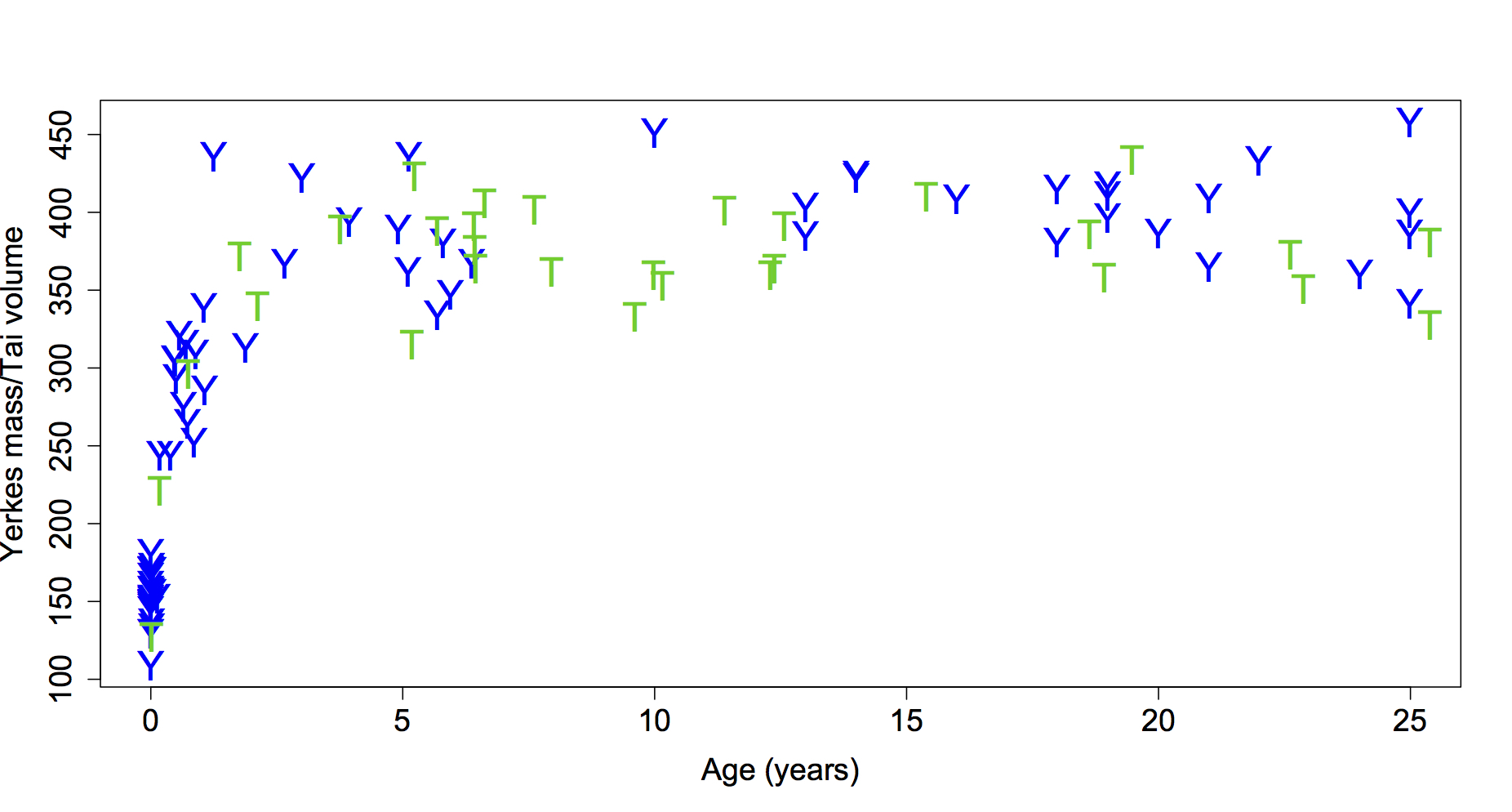
Although I usually present in evolution and fossil-focused sessions, my recent interest in brain growth landed me in a session devoted to Primate Life History this year. The publication of endocranial volumes (ECVs) from wild chimpanzees of known age from Taï Forest (Neubauer et al., 2012) led me to ask whether this cross-sectional sample displays the same pattern of size change as seen in captive chimpanzee brain masses (Herndon et al., 1999). These are unique datasets because precise ages are known for each individual, and this information is generally lacking for most skeletal populations. We therefore have a unique opportunity to estimate patterns and rates of growth, and to compare different populations. Here are the data up to age 25 (the oldest known age of the wild chimps):
Brain size plotted against age in chimpanzees. Blue Ys are the Yerkes (captive) apes and green Ts are the Taï (wild) chimps. Note that Yerkes data are brain masses while the Taï data are endocranial volumes (ECVs). Mass and volume – as different as apples and oranges, or as oranges and tangerines? Note the relatively high “Y” at 1.25 years, who was omitted from the subsequent analysis.
This is an interesting comparison for a few reasons. First, to the best of my knowledge brain size growth hasn’t been compared between chimp populations (although it has been compared between chimps and bonobos: Durrleman et al., 2012). Second, many studies have found differences in tooth eruption, maturation and skeletal growth and development between wild and captive animals, but again I don’t think this has been examined for brain growth. Finally, and most fundamentally, it’s not clear whether ECV and brain mass follow the same basic pattern of change (brain mass but not ECV is known to decrease at older ages in humans and chimps, but at younger ages…?.
So to first make the datasets comparable, I used published data to examine the relationship between brain mass and ECV in primates, to estimate the likely ECV of the Yerkes brain masses. Two datasets examine adult brain size across different primate species (red and blue in the plot below), and one looks at brain mass and ECV of individuals for a combined sample of gorillas (McFarlin et al., 2013) and seals (Eisert et al., 2013). In short, ECV and brain mass in these datasets give regression slopes not significantly different from 1. One dataset has a negative y-intercept significantly different from 0, meaning that ECV should actually be slightly less than brain mass, but I think this pattern is driven by the really small-brained animals like New World Monkeys).
The relationship between endocranial volume and brain mass in primates (and Weddell seals). Solid lines and shaded confidence intervals are given for each regression, and the dashed line represents isometry, or a 1:1 relationship (ECV=brain mass). The rug at the bottom shows the range of the Yerkes masses. Note that the red and black regressions are not significantly different from isometry, while the blue regression is shifted slightly below isometry.
So let’s assume for now that the ECVs of the Yerkes apes are the same as their masses, meaning the two datasets are directly comparable. There are lots of ways to mathematically model growth, and as George Box famously quipped, “All models are wrong, but some are useful.” Here, I wanted to use something that explained the greatest amount of ontogenetic variation in ECV while also levelling off once adult brain size was reached (by 5 years based on visual inspection of the first plot above). This led me to the B-spline. With some tinkering I found that having two knots, one between each 0.1-2.5 and 2.6-5, provided models that fit the data pretty well, and I resampled knot combinations to find the best fit for each dataset. The result:
B-splines describing the relationship between ECV (or brain mass) and age in the TaÏ (green) and Yerkes (blue) data. Note that although the Yerkes line is elevated above the Taï line after 4 years, the confidence intervals (shaded regions) overlap at all ages.
These models fit the data pretty well (r-squared >0.90), and nicely capture the major changes in growth rates. Resampling knot positions reveals best-fit models with different knots for each sample, but otherwise the two models cannot be statistically distinguished from one another: the 95% confidence intervals of both the model coefficients and brain size estimates overlap. So statistical modelling of brain growth in these samples suggests they’re the same, but there are some hints of difference.
Growth rates at each age calculated from the B-spline regressions. Note these are arithmetic velocities and not first derivatives of the growth curves. The dashed horizontal line at 0 indicates the end of brain size growth.
Converting the growth curves to arithmetic velocities we see what accounts for the subtle differences between samples. The velocity plot hints that, in these cross-sectional data, brain size increases rapidly after birth but growth slows down and ends sooner in Taï than among the Yerkes apes. I’m cautious about over-interpreting this difference, since there is great overlap between growth curves, and there is only one Taï newborn compared to about 20 in Yerkes: even just a few more newborns from Taï might reveal greater similarity with Yerkes.
So there you have it, it looks like the wild Taï and captive Yerkes chimps follow basically the same pattern of brain growth, despite living in different environments. Whereas the generally greater stressors in the wild often lead to different patterns of skeletal and dental development in wild vs. captive settings, brain growth appears pretty robust to these environmental differences. That brain growth should be canalized is not too surprising, given the importance of having a well-developed brain for survival and reproduction. But it’s cool to see this theoretical expectation borne out with empirical observations.
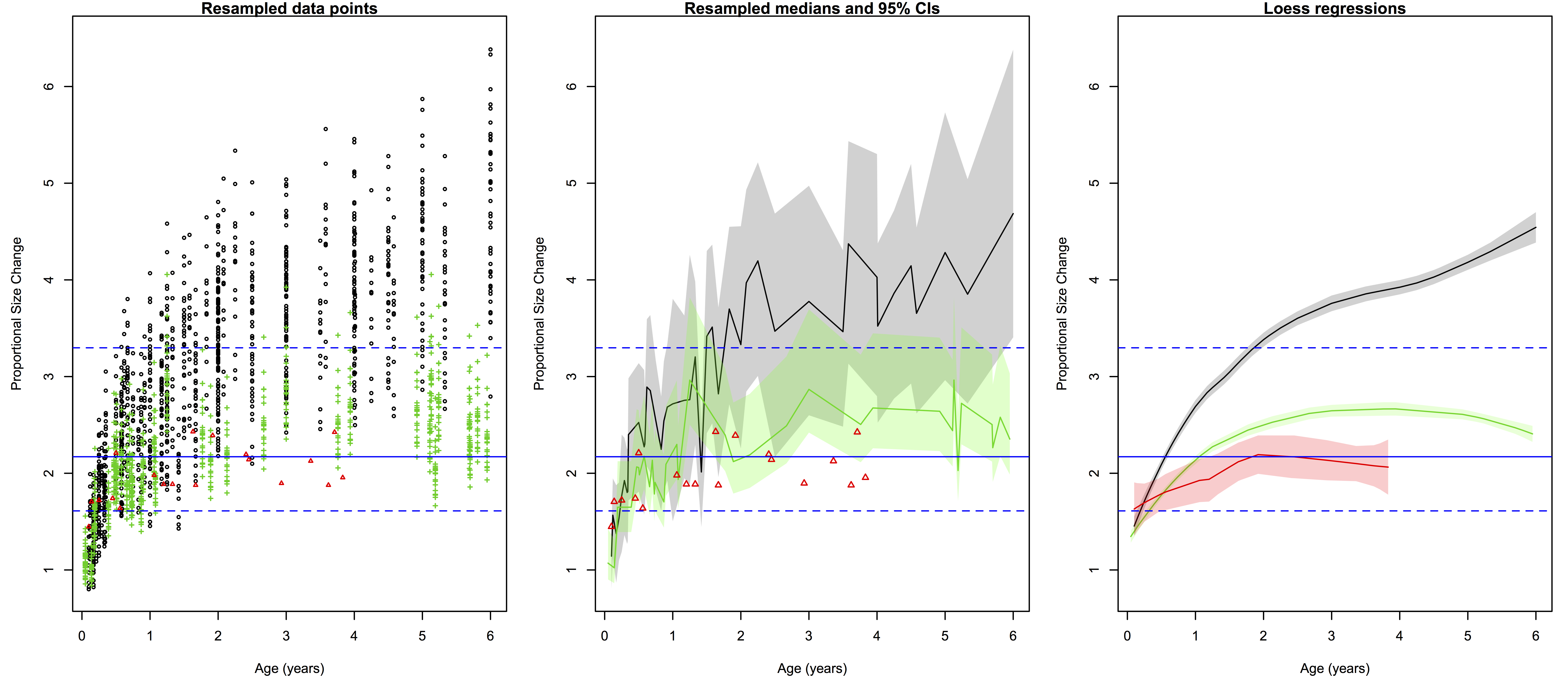
I’m finally about to push my study of brain growth in H. erectus out of the gate, and one of the finishing touches was to make pretty pretty pictures. Recall from the last post on the subject that I was resampling pairs of individual brain sizes to compute how much proportional brain size change (PSC) occurred from birth a given age in humans and chimpanzees (and now gorillas). This resulted in lots of data points, which can be a bit difficult to read and interpret when plotted. Ah, cross-sectional data. “HOW?!” I asked, “HOW CAN I MAKE THIS MORE DIGESTIBLE?” Having nice and clean plots is useful regardless of what you study, so here I’ll outline some solutions to this problem. (If you want to figure this out for yourself, here are the raw resampled data. Save it as a .csv file and load it into R)
Ratios of proportional size change from birth to a later age. Black/gray=humans, green=chimpanzees, red=gorillas. Left are all 2000 resampled ratios, center shows the medians (solid lines) and 95% quantiles of the ratios for each species at a given age (the small gorilla sample is still data points), and right are the loess regression lines and (shaded) 95% confidence intervals. Blue lines across all three plots are the H. erectus median (solid) and 95% quantiles (dashed).
The left-most plot above shows the raw resampled ratios: you can see a lot of overlap between humans (black), chimpanzees (green) and gorillas (red). But all those points are a bit confusing: just how extensive is the overlap? What is the central tendency of each species?
The second plot shows a less noisy way of displaying the results. We can highlight the central tendencies by plotting PSC medians for each age (I used medians and not means since the data are not normally distributed), and rather than showing the full range of variation in PSC at each age, we can simply highlight the majority (95%) of the values.
To make such a plot in R, for each species you need four pieces of information, in vector form: 1) the unique (non-repeated) ages sorted from smallest to largest, and the 2) median, 3) upper 97.5% quantile, and 4) lower 0.025% quantile for each unique age. You can quickly and easily create these vectors using R‘s built-in commands:
R codes to create the vectors of points to be plotted in the second graph. Note that vectors are not created for gorillas because the sample size is too small, or for H. erectus because the distribution is basically the same across all ages.
With these simple vectors summarizing humans and chimpanzees variation across ages, you’re ready to plot. The medians (hpm and ppm in the code above) can simply be plotted against age using the plot() and lines() functions, simple enough. But the shaded-in 95% quantiles have to be made using the polygon() function, which creates a shape (a polygon) by connecting sets of points that have to be entered confusingly: two sets of x-coordinates with the first in normal order and the second reversed, and two sets of y-coordinates with the first in normal order and the second reversed.
Plot yourself down and have a beer.
In our case, the first set of x coordinates is the vector of sorted, unique ages (h and p in the code), and the second set is the same vector but in reverse. The first set of y coordinates is the vector of 97.5% quantiles (hpu and ppu), and the second set is the vector of 0.025% quantiles in reverse. You can play around with ranges of colors and transparency with “col=….”
What I like about the second plot is that it clearly summarizes the ranges of variation for humans and chimps, and highlights which parts of the ranges overlap: the human and ape medians are comparable at the youngest ages, but by 6 months the human median is pretty much always above the chimpanzee upper range. The gorilla points are generally close to the chimpanzee median until around 2 years after which gorilla size increase basically stops but chimpanzees continue. Importantly, we can also see at what ages the simulated H. erectus values are most similar to the empirical species values, and when they fall out of species’ ranges. As I pointed out a bajillion years ago, the H. erectus values (based on the Mojokerto juvenile fossil) encompass most living species’ values around six months to two years.
I also like that second plot does all the above, and still honestly shows the jagged messiness that comes with cross-sectional, resampled data. Of course no individual’s proportional brain size increases and decreases so haphazardly during growth as depicted in the plot. It’s ugly but it’s honest. But if you like lying to yourself about the nature of your data, if you prefer curvy, smoothed inference to harsh, gritty reality, you can resort to the third plot above: the loess regression lines calculated from the resampled data.
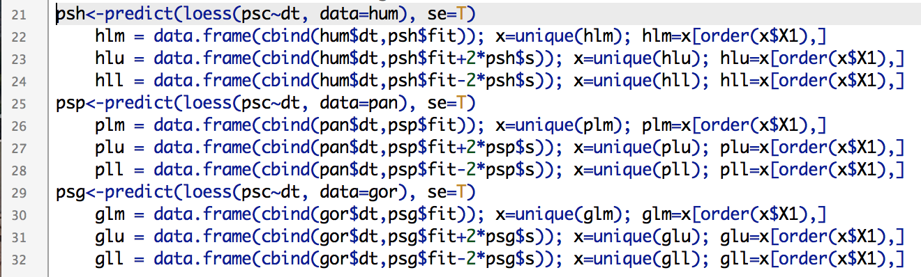
Loess and lowess (not to be confused with loess) refer to locally weighted regression scatterplot smoothing, a way to model gross data like we have, but with a nice and smooth (but not straight) line. Because R is awesome, it has a loess() function built right in. The function easily does the math, and you can quickly obtain confidence intervals for the modelled line, but plotting these is another story. After scouring the internet, coding and failing (repeatedly) I finally came up with this:
Creating vectors of points makes your lines clean and smooth.
If you simply try to plot a loess() line based on 1000s of unordered points, you’ll get a harrowing spider’s web of lines between all the points. Instead, you need to create ordered vectors of the non-repeated modelled points (hlm, plm, glm, above) and their upper and lower confidence limits. Once modelled, you can simply plot the lines and create polygons based on the confidence intervals as above.
The best way to learn to do stuff in R is to just play around with data and code until you figure out how to do whatever it is you have in mind. If you want to recreate, or alter, what I’ve described here, you can download the resampled data (link at the beginning of the post) and R code. Good luck!
Last week, I discussed the implications of the Gona hominin pelvis for body size and body size variation in Homo erectus. One of the bajillion things I have been working on since this post is elaborating on this analysis to write up, so stay tuned for more developments!
Now, when we compared the gross size of the hip joint between fossil Homo and living apes (based on the femur head in most specimens but the acetabulum in Gona and a few other fossils), the range of variation in Homo-including-Gona was generally elevated above variation seen in all living great apes. This is impressive, since orangutans and gorillas show a great range of variation due sexual dimorphism (normal differences between females and males). However, I noted that the specimens I used were unsexed, and so the resampling strategy used to quantify variation within a species – randomly selecting two specimens and taking the ratio of the larger to smaller – probably underestimated sexual dimorphism.
Shortly after I posted this, Dr. Herman Pontzertwitterated me to point out he has made lots of skeletal data freely available on his website (a tremendous resource). The ape and human data I used for last week’s post did not have sexes (my colleague has since sent me that information), but Pontzer’s data are sexed (no, not “sext“). So, I modified and reran the original resampling analysis using the Pontzer data, and it nicely illustrates the difference between using a max/min vs. male/female ratio to compare variation:
Hip joint size variation in living African apes (left and right) compared with fossil humans (genus Homo older than 1 mya, center). Each plot is scaled to show the same y-axis range. On the left are ratios of max/min from resampled pairs from each species (sex not taken into account). On the right are ratios of male/female from resampled pairs from each species. The red stars on this plot are the medians for max/min ratios (the thick black bars in the left plot). The center plot shows ratios of Homo/Gona.
The left plot shows resampled ratios of max/min in humans, chimpanzees and gorillas, while the right shows ratios of male/female in these species. If no assumption is made about a specimen’s sex (left plot), it is possible to resample a pair of the same sex, and so it is likelier to sample two individuals similar in size. Note that the ratio of max/min can never be less than 1. However, if sex is taken into account (right plot), we see two key differences. First, because of size overlap between males and females in humans and chimpanzees, ratios can fall below 1. Adult gorilla males are much larger than females, and so the ratio is never as low as 1 (minimum=1.08). Second, in more dimorphic species, the male/female ratio is elevated above the max/min ratio (red stars in the right plot). In chimpanzees, the median male/female ratio is actually just barely lower than the median max/min ratio. If you want numbers: the median max/min ratios for humans, chimpanzees and gorillas are 1.09, 1.06 and 1.16, respectively. The corresponding median male/female ratios are 1.15, 1.06 and 1.25.
Regarding the fossils, if we assume that Gona is female and all other ≥1 mya Homo hips are male, the range of hip size variation can be found within the gorilla range, and less often in the human range.
But the story doesn’t end here. One thing I’ve considered for the full analysis (and as Pontzer also pointed out on Twitter) is that the relationship between hip joint size and body weight is not the same between humans and apes. As bipeds, we humans place all our upper body weight on our hips; apes aren’t bipedal and so relatively less of their weight is transmitted through this joint. As a result, human hip joint size increases faster with increasing body mass than it does in apes.
So for next installment in this fossil saga, I’ll consider body mass variation estimated from hip joint size. Based on known hip-body size relationships in humans vs. apes, we can predict that male/female variation in humans and fossil hominins will be relatively higher than the ratios presented here – will this put fossil Homo-includng-Gona outside the gorilla range of variation? Stay tuned to find out!
I teach Tuesdays and Thursdays this year, leaving Fridays welcomely wide open for non-teaching related productivity. Today’s task is arguably the most exhilarating aspect of doing Science – inspecting raw data to make sure there are no major errors or problems in the dataset, so I can then analyze it and change the world. The excitement is truly hard to contain.
Delectable dog food is the dataset; I’m the dog.
No, it’s not the funnest, but it’s an important part of doing Science. To make your life easier, you should inspect data daily as you collect them. This way, you can identify mistakes and make notes about outliers early on, so that you are not stupefied and stalemated by what you see when you sit down to begin analysis.
You (corgi) are getting ready to analyze and you find an anomalous observation (door stop) you didn’t notice when you were collecting data.
Today I’m looking at measurements I took from ape mandibles housed in an English museum last summer; I inspected data before I left the UK for KZ, so today should be a breeze. But no matter how meticulous you are in the field/museum, you still need to inspect your data before analyzing them, just to be safe. If you’re as disorganized as I am, there will be lots of programs each with lots of windows. Here’s a tip: plug into multiple monitors (or at least one big ass monitor), so you can easily espy all open windows and programs in prodigious panorama.
Using two monitors helps when checking data for errors and patterns. On my left screen I’m using R to visualize and examine the raw data open in Excel on the right screen. If something seems off on the left screen, I can quickly consult the original spreadsheet on the right.
Barely visible in the above screenshot, these are chimpanzee (red) and gorilla (black) mandible measurements plotted against a measure of body size, preliminarily described in this post from last August. I’m looking at whether any mandibular measurements track body size across the subadult growth period, in hopes that bodily growth can be studied in fossil species samples dominated by kid jaws. As you can (barely) see, some jaw measurements correlate with body size better than others, and sometimes the apes follow similar patterns but other times they don’t.
The data look good, so now I can go on to examine relationships between mandible and body size in more detail. Stay tuned for results!