Worst year in review

As we’re wrapping up what may be the worst year in recent global memory, especially geopolitically, let’s take a moment to review some more positive things that came up at Lawnchair in 2016.

Headed home

IMG_20160801_143520

Alternate subtitle: Go West
This was a quiet year on the blog, with only 18 posts compared with the roughly thirty per year in 2014-2015. The major reason for the silence was that I moved from Kazakhstan back to the US to join the Anthropology Department at Vassar College in New York. With all the movement there was  less time to blog. Much of the second half of 2016 was spent setting up the Biological Anthropology Lab at Vassar, which will focus on “virtual” anthropology, including 3D surface scanning…

20161111_141908.jpg

Cast of early Homo cranium KNM-ER 1470 and 3D surface scan made in the lab using an Artec Spider.

… and 3D printing.

20161107_135616

gibbon endocast, created from a CT scan using Avizo software and printed on a Zortrax M200.

This first semester stateside I reworked my ‘Intro to Bio Anthro’ and ‘Race’ courses, which I think went pretty well being presented to an American audience for the first time. The latter class examines human biological variation, situating empirical observations in modern and historical social contexts. This is an especially important class today as 2016 saw a rise in nationalist and racist movements across the globe. Just yesterday Sarah Zhang published an essay in The Atlantic titled, “Will the Alt-right peddle a new kind of racist genetics?” It’s a great read, and I’m pleased to say that in the Race class this semester, we addressed all of the various social and scientific issues that came up in that piece. Admittedly though, I’m dismayed that this scary question has to be raised at this point in time, but it’s important for scholars to address and publicize given our society’s tragically short and selective memory.

So the first semester went well, and next semester I’ll be teaching a seminar focused on Homo naledi and a mid-level course on the prehistory of Central Asia. The Homo naledi class will be lots of fun, as we’ll used 3D printouts of H. naledi and other hominin species to address questions in human evolution. The Central Asia class will be good prep for when I return to Kazakhstan next summer to continue the hunt for human fossils in the country.

Osteology is still everywhere

A recurring segment over the years has been “Osteology Everywhere,” in which I recount how something I’ve seen out and about reminds me of a certain bone or fossil. Five of the blog 18 posts this year were OAs, and four of these were fossiliferous: I saw …

2016-02-09 16.26.31

Anatomy terminology hidden in 3D block letters,

Picture1

Hominin canines in Kazakhstani baursaki cakes,

Picture1

The Ardipithecus ramidus ilium in Almaty,

screen-shot-2016-11-26-at-5-36-05-pm

Homo naledi juvenile femur head in nutmeg,

bangkok-erectus

And a Homo erectus cranium on a Bangkok sidewalk. As I’m teaching a fossil-focused seminar next semester, OA will probably become increasingly about fossils, and I’ll probably get my students involved in the fun as well.

New discoveries and enduring questions

The most-read post on the blog this year was about the recovery of the oldest human Nuclear DNA, from the 450,000 year old Sima de los Huesos fossils. My 2013 prediction that nuclear DNA would conflict with mtDNA by showing these hominins to be closer to Neandertals than Denisovans was shown to be correct.

giphy

These results are significant in part because they demonstrate one way that new insights can be gained from fossils that have been known for years. But more intriguingly, the ability of researchers to extract DNA from exceedingly old fossils suggests that this is only the tip of the iceberg.

The other major discoveries I covered this year were the capuchin monkeys who made stone tools and the possibility that living humans and extinct Neandertals share a common pattern of brain development.

Pride & Predator

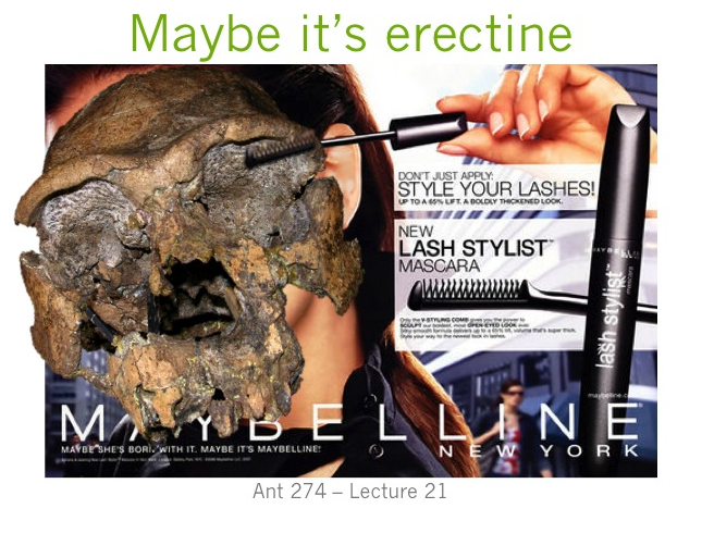
An unrelated image from 2016 that makes me laugh.

The comparison between monkey-made and anthropogenic stone tools drives home the now dated fact that humans aren’t the only rock-modifiers. But the significance for the evolution of human tool use is less clear cut – what are the parallels (if any) in the motivation and modification of rocks between hominins and capuchins, who haven’t shared a common ancestor for tens of millions of years? I’m sure we’ll hear more on that in the coming years.

In the case of whether Neandertal brain development is like that of humans, I pointed out that new study’s results differ from previous research probably because of differences samples and methods. The only way to reconcile this issue is for the two teams of researchers, one based in Zurich and the other in Leipzig, to come together or for a third party to try their hand at the analysis. Maybe we’ll see this in 2017, maybe not.

There were other cool things in 2016 that I just didn’t get around to writing about, such as the publication of new Laetoli footprints with accompanying free 3D scans, new papers on Homo naledi that are in press in the Journal of Human Evolution, and new analysis of old Lucy (Australopithecus afarensis) fossils suggesting that she spent a lifetime climbing trees but may have sucked at it. But here’s hoping that 2017 tops 2016, on the blog, in the fossil record, and basically on Earth in general.

Osteology Everywhere: Skull in the Stone #FossilFriday edition

It’s that time of year again.

233313fc41ee3a63_tumblr_mgdqksndiz1ro7sbfo1_400-xxxlarge

It’s the end of the year and I’ve got Homo erectus on the brain somethin fierce. Our precedent-erect first popped up in Africa around 1.9 million years ago, quickly spread throughout much of the Old World, and persisted until perhaps as late as ~ 100,000 years ago in Java, Indonesia. This was a very successful species by all accounts, and as a result of its great range and duration, you can imagine it was also pretty variable.

screen-shot-2016-12-23-at-3-26-15-pm

Hominin brain sizes. Boxes and whiskers represent sample tendencies and points are individual specimens. 1 = Australopithecus, 2 = Early Homo (cf. habilisrudolfensis), 3 = Dmanisi H. erectus, 4 = Early African H. erectus, 5 = Early Indonesian H. erectus, 6 = Chinese H. erectus, 7 = Later Indonesian H. erectus, 8 = modern humans.

Despite this great variation, H. erectus skulls generally share a common visage: long and low cranial vault, low forehead, protruding brow ridges, fun tuberosities and tori in the back. You’d recognize them anywhere. Including the sidewalk!

20161220_202353.jpg

Homo erectus in front of Ploenchit Tower, Bangkok (lateral view, front is to the right).

The relief in this sidewalk slat superficially looks like a trace fossil of partial H. erectus cranium, the face either missing (from the lower right) or taphonomically displaced toward the left side of the tile (see here for actual H. erectus trace fossils). This looks really similar to H. erectus from Indonesia, not surprising given its discovery in Thailand. Why, it could have come straight out of Figure 6 from a 2006 paper by Yousuke Kaifu and colleagues:

Bangkok erectus.png

Left lateral views of Javanese H. erectus crania, modestly modified from Kaifu et al. (2006: Fig. 6). Front is to the left this time.

Using my insane photo editing skills, I’ve inserted the Ploenchit Tower trace fossil (reversed) within the horde of heads presented by Kaifu et al., above. Like many of the real fossils, the Ploenchit specimen is missing the face (due to taphonomy), the supraorbital torus or brow ridge juts out from a low-rising forehead, and the occipital bone also projects out about from the otherwise rounded contour of the cranium. Note that there is a good deal of variation in each of these features among the real fossils.

What a happy holiday accident to find a Homo erectus cranium on the street!

seinfeld-its-a-festivus-miracle

ResearchBlogging.org Reference
Kaifu Y, Aziz F, Indriati E, Jacob T, Kurniawan I, & Baba H (2008). Cranial morphology of Javanese Homo erectus: new evidence for continuous evolution, specialization, and terminal extinction. Journal of human evolution, 55 (4), 551-80 PMID: 18635247

Bioanthro lab activity: Hominin brain size

Last week in my Human Evolution class we looked at whether we could estimate hominin brain sizes, or endocranial volumes (ECV), based on just the length and width of the bony brain case. Students took these measurements on 3D surface meshes…

Maximum cranial length in Australopithecus boisei specimen KNM-ER 406.

Maximum cranial length in Australopithecus boisei specimen KNM-ER 406.

… and then plugged their data into equations relating these measurements to brain size in chimpanzees (Neubauer et al., 2012) and humans (Coqueugniot and Hublin, 2012).

The relationship between cranial length (x axis) and ECV (y axis).

The relationship between cranial length (x axis) and ECV (y axis). Left shows the chimpanzee regression (modified from Fig. 2 in Neubauer et al., 2012), while the right plot is humans (from the Supplementary Materials of Coqueugniot and Hublin, 2012).

So in addition to spending time with fossils, students also learned about osteometric landmarks with fun names like “glabella” and “opisthocranion.” More importantly, students compared their estimates with published endocranial volumes for these specimens, based on endocast measurements:

Human and chimpanzee regression equations don't do great at estimating hominin brain sizes.

Human and chimpanzee regression equations don’t do great at predicting hominin brain sizes. Each point is a hominin fossil, the x value depicting its directly-measured endocranial volume and the y value its estimated volume based on different regression equations. Black and red points are estimates based on chimpanzee cranial width and length, respectively, while green and blue points are based on human width and length, respectively. The dashed line shows y=x, or a correct estimate.

This comparison highlights the point that regression equations might not be appropriate outside of the samples on which they are developed. Here, estimates based on the relationship between cranial dimensions and brain size in chimpanzees tend to underestimate fossils’ actual values (black and red in the plot above), while the human regressions tend to overestimate hominins’ brain sizes. Students must think about why these equations perform poorly on fossil hominins.

Here are the lab materials so you can use and adapt this for your own class:

Lab 4-Brain size (Instructions & questions)

Lab 4 data table (with equations)

ResearchBlogging.orgReferences
Coqueugniot, H., & Hublin, J. (2012). Age-related changes of digital endocranial volume during human ontogeny: Results from an osteological reference collection American Journal of Physical Anthropology, 147 (2), 312-318 DOI: 10.1002/ajpa.21655

Neubauer, S., Gunz, P., Schwarz, U., Hublin, J., & Boesch, C. (2012). Brief communication: Endocranial volumes in an ontogenetic sample of chimpanzees from the taï forest national park, ivory coast American Journal of Physical Anthropology, 147 (2), 319-325 DOI: 10.1002/ajpa.21641

eFfing #FossilFriday: Rekindling an old friend’s hip

Sorry for the crappy pun. Carol Ward and colleagues recently reported an associated hip joint, KNM-ER 5881, attributable to the genus Homo (1.9 million years old). Fossils coming from the same skeleton are pretty rare, but what’s more remarkable is that portions of this bone were discovered 29 years apart: a femur fragment was first found in 1980, and more of the femur and part of the ilium were found at the same location when scientists returned in 2009:

Figure 3 from Ward et al. 2015.

Figure 3 from Ward et al. 2015. A little distal to the hip, yes, but the pun still works. Views are, going clockwise starting at the top the top left, from above, from below, from the back, from the side, and from the front.

There’s also a partial ilium associated with the femur – that makes a pretty complete hip!

Figure 5 from Ward et al. shows the fossil. Jump for joy that it's complete enough for us to tell it comes from the left side!

Figure 5 from Ward et al. shows the fossil. Jump for joy that it’s complete enough for us to tell it comes from the left side!

Despite how fragmentary the femur and ilium are, the researchers were able to estimate the diameter of the femur head and hip socket reliably. The hip joints are smaller than all Early Pleistocene Homo except for the Gona pelvis. Comparing ER 5881 the large contemporaneous KNM-ER 3228 hip bone, the authors found these two specimens to be more different in size than is usually seen between sexes of many primate species. The size difference best matches male-female differences in highly dimorphic species like gorillas.

Ward et al. find that the specimen generally looks like early Homo but that the inferred shape of the pelvic inlet is a little different from all other Early and Middle Pleistocene human fossils. The authors take this discrepancy to suggest that there was more than one “morphotype” (‘kind of shape’), and therefore possibly species, of Homo around 1.9 million years ago. While I wouldn’t just yet go so far as to say this anatomy is due to species differences, I do agree that KNM ER 5881 helps our understanding and appreciation of anatomical variation in our early ancestors. Like all great fossil discoveries, the more we find, the more we learn that we don’t know. Here’s to more Homo hips in the near future!

Osteology everywhere: Graffiti

Astana, the wedding-cake capital of Kazakhstan, is notably bereft of graffiti and street art, at least in my somewhat limited exposure to the city. The larval metropolis is all about commercial appearance, so I’d guess that aspiring street artists likely face much more than the Marge Simpson treatment for turning around to brag about their work.

Dire consequences await those who graffito tag public property.

Dire consequences await those who graffito tag public property.

Once, I did see a pretty badass street mural,

But it was in München.

but it was in München, a mere 2,620 miles from Astana.

No, there is not much in the way of secretly donated street art here in Astana, and there’s generally little hope to see graffiti-grafted Osteology Everywhere. But this weekend, I noticed these four magical letters, quickly quietly scrawled on the side of my apartment building:

2015-01-17 14.34.37

DAKA.

Two disconcerting thoughts immediately come to mind reading this. First, why the hell is “DAKA” written in Latin instead of Cyrillic script characteristic of the FSU? Second, what does “DAKA” mean out here? Nothing in Russian so far as I know, but Google Translate claims it could mean “Dakar” in Kazakh, which if true raises even more questions.

No, the safest assumption is that this tagger, my streetwise and marker-wielding dopplegänger, was referring to the ~1 million year old Homo erectus partial skull from Ethiopia, dubbed “Daka” after the Dakanihylo site of its discovery.

The Daka calvaria (Figure 2. of Asfaw et al., 2002). Counterclockwise from the top left: view from the back, view from the top (front is to the left), view from the left, a mosquito net, view from the bottom (front is at the top), viewed from the front.

BOU-VP-2/66, the Daka calvaria* (Figure 2. of Asfaw et al., 2002). Counterclockwise from the top left: view from the back, view from the top (front is to the left), view from the left, a mosquito net, view from the bottom (front is at the top), and view from the front. *Calvaria is the fancy word for ‘bony skull without a face.’

Daka isn’t the first hominin fossil to be embraced outside of anthropology. A few years ago I noticed the 4.4 million year old Ardipithecus ramidus skeleton strutting across the label of a Dogfish Head beer bottle:

2011-11-12_14-41-32_247

GOODGRIEF, this was almost 5 years ago.

In downtown Tbilisi, Georgia I recently spotted a Dmanisi-based duo whose tech savvy belies the fact they’re based on 1.8 million year old fossils:

20141013_141725

(Let’s not forget this one, from before they got smartphones)

We’ll have to do some serious fossil-finding here in Kazakhstan before they’ll let anyone put up something this awesome on the side of anything here in Astana. (Or wait…)

Another small Middle Pleistocene person

Last year I brought up the implications of the small female pelvis from Gona, Ethiopia for body size variation in Homo erectus (see previous post). This individual was much smaller than other Middle Pleistocene Homo fossils, indicating size variation comparable to highly sexually dimorphic gorillas and unlike recent human populations. Before this pelvis, most known Homo erectus fossils were fairly large (comparable to living people), with only a few hints of much smaller individuals (e.g., KNM-ER 427000, KNM-OL 45500). Now joining this petite party, this tiny troop, this little lot, this compact cadre, etc., is KNM-WT 51261, a 750,000 year old molar from Kenya (Maddux et al., in press).

Occlusal area for hominin first molars. The tooth is from Fig. 2 and the plot from Fig. 3 in the paper.

Occlusal area for first molars in the genus Homo. The tooth image is from Fig. 2 and the plot from Fig. 3 in Maddux et al. Lookit how tiny it is!

This ‘new’ specimen substantially increases the range of size variation among early African H. erectus molars, although the expanded range isn’t remarkable compared with later Homo samples such as from Zhoukoudian cave in China or Neandertals. What is different, though, is that most of the highly variable samples show a fairly continuous range of variation, while the WT 51261 molar is a considerable outlier from the rest of the African Middle Pleistocene sample (a lot like the situation with the Gona pelvis). So this tooth re-raises an important question: were smaller specimens like Gona and WT 51261 as rare in life as they are in the fossil record, or was such great size variation common in the Middle Pleistocene? How we reconstruct what kind of animal Homo erectus was differs depending on the answer to this question.

My ESHE poster is Gona blow your mind

I’m in Italy for the annual meeting of the European Society for the Study of Human Evolution. It’s been a great conference, seeing interesting talks (check out #eshe2014 on Twitter), meeting old friends and meeting new ones, and enjoying excellent food and espresso. Here’s the poster I presented yesterday (download pdf):Screen Shot 2014-09-20 at 9.33.38 AM

It’s a follow-up to posts here and here. The long and short of it is, there was a substantial amount of body size variation (i.e., between males and females) in Homo erectus, on par with levels seen in modern day gorillas. This is interesting because H. erectus brain size (and brain size growth) would have required massive amounts of energy, so some have hypothesized a cooperative breeding strategy; sexually dimorphic species generally do not engage in such cooperative behavior. So I suggest that body size variation in H. erectus is an ecological strategy, with small female body size reducing the metabolic burden on mothers.

A picture is worth a thousand datapoints in #rstats

I’m finally about to push my study of brain growth in H. erectus out of the gate, and one of the finishing touches was to make pretty pretty pictures. Recall from the last post on the subject that I was resampling pairs of individual brain sizes to compute how much proportional brain size change (PSC) occurred from birth a given age in humans and chimpanzees (and now gorillas). This resulted in lots of data points, which can be a bit difficult to read and interpret when plotted. Ah, cross-sectional data. “HOW?!” I asked, “HOW CAN I MAKE THIS MORE DIGESTIBLE?” Having nice and clean plots is useful regardless of what you study, so here I’ll outline some solutions to this problem. (If you want to figure this out for yourself, here are the raw resampled data. Save it as a .csv file and load it into R)

All

Ratios of proportional size change from birth to a later age. Black/gray=humans, green=chimpanzees, red=gorillas. Left are all 2000 resampled ratios, center shows the medians (solid lines) and 95% quantiles of the ratios for each species at a given age (the small gorilla sample is still data points), and right are the loess regression lines and (shaded) 95% confidence intervals. Blue lines across all three plots are the H. erectus median (solid) and 95% quantiles (dashed).

The left-most plot above shows the raw resampled ratios: you can see a lot of overlap between humans (black), chimpanzees (green) and gorillas (red). But all those points are a bit confusing: just how extensive is the overlap? What is the central tendency of each species?

The second plot shows a less noisy way of displaying the results. We can highlight the central tendencies by plotting PSC medians for each age (I used medians and not means since the data are not normally distributed), and rather than showing the full range of variation in PSC at each age, we can simply highlight the majority (95%) of the values.

To make such a plot in R, for each species you need four pieces of information, in vector form: 1) the unique (non-repeated) ages sorted from smallest to largest, and the 2) median, 3) upper 97.5% quantile, and 4) lower 0.025% quantile for each unique age. You can quickly and easily create these vectors using R‘s built-in commands:

R codes to create the vectors of points to be plotted in the second graph. Note that vectors are not created for gorillas because the sample size is too small, or for H. erectus because the distribution is basically the same across all ages.

R codes to create the vectors of points to be plotted in the second graph. Note that vectors are not created for gorillas because the sample size is too small, or for H. erectus because the distribution is basically the same across all ages.

With these simple vectors summarizing humans and chimpanzees variation across ages, you’re ready to plot. The medians (hpm and ppm in the code above) can simply be plotted against age using the plot() and lines() functions, simple enough. But the shaded-in 95% quantiles have to be made using the polygon() function, which creates a shape (a polygon) by connecting sets of points that have to be entered confusingly: two sets of x-coordinates with the first in normal order and the second reversed, and two sets of y-coordinates with the first in normal order and the second reversed.

Plot yourself down and have a beer.

Plot yourself down and have a beer.

In our case, the first set of x coordinates is the vector of sorted, unique ages (h and p in the code), and the second set is the same vector but in reverse. The first set of y coordinates is the vector of 97.5% quantiles (hpu and ppu), and the second set is the vector of 0.025% quantiles in reverse. You can play around with ranges of colors and transparency with “col=….”

What I like about the second plot is that it clearly summarizes the ranges of variation for humans and chimps, and highlights which parts of the ranges overlap: the human and ape medians are comparable at the youngest ages, but by 6 months the human median is pretty much always above the chimpanzee upper range. The gorilla points are generally close to the chimpanzee median until around 2 years after which gorilla size increase basically stops but chimpanzees continue. Importantly, we can also see at what ages the simulated H. erectus values are most similar to the empirical species values, and when they fall out of species’ ranges. As I pointed out a bajillion years ago, the H. erectus values (based on the Mojokerto juvenile fossil) encompass most living species’ values around six months to two years.

I also like that second plot does all the above, and still honestly shows the jagged messiness that comes with cross-sectional, resampled data. Of course no individual’s proportional brain size increases and decreases so haphazardly during growth as depicted in the plot. It’s ugly but it’s honest. But if you like lying to yourself about the nature of your data, if you prefer curvy, smoothed inference to harsh, gritty reality, you can resort to the third plot above: the loess regression lines calculated from the resampled data.

Loess and lowess (not to be confused with loess) refer to locally weighted regression scatterplot smoothing, a way to model gross data like we have, but with a nice and smooth (but not straight) line. Because R is awesome, it has a loess() function built right in. The function easily does the math, and you can quickly obtain confidence intervals for the modelled line, but plotting these is another story. After scouring the internet, coding and failing (repeatedly) I finally came up with this:

Screen Shot 2014-07-26 at 6.57.01 PM

Creating vectors of points makes your lines clean and smooth.

If you simply try to plot a loess() line based on 1000s of unordered points, you’ll get a harrowing spider’s web of lines between all the points. Instead, you need to create ordered vectors of the non-repeated modelled points (hlm, plm, glm, above) and their upper and lower confidence limits. Once modelled, you can simply plot the lines and create polygons based on the confidence intervals as above.

The best way to learn to do stuff in R is to just play around with data and code until you figure out how to do whatever it is you have in mind. If you want to recreate, or alter, what I’ve described here, you can download the resampled data (link at the beginning of the post) and R code. Good luck!

The small, big new Dmanisi skull

The 5th skull early Homo skull from the site of Dmanisi was announced last week. The skull was discovered nearly 10 years ago, but is finally (and very comprehensively) published in Science (Lordkipanidze et al. 2013). The ‘new’ D4500 cranium goes with the massive D2600 mandible, making this the earliest and most complete skull of Homo that I know of. It’s really a remarkable specimen, for a number of reasons beyond its age and completeness. I’ve been busy traveling, teaching and writing lately, so I haven’t yet gotten to pore over the details as much as I’d like. So I hope to sporadically post thoughts on this badass new skull as they come to me. In the mean time, several of what I’d consider the top biology/anthropology blogs*** have discussed the skull, so do check those out if you haven’t already.

The first thing I noted about D4500 is its small brain size, estimated at a mere 546 cubic centimeters. For perspective, D4500 is the green point in the following plot showing brain size in early human evolution:

Endocranial volume for various fossil hominin fossils. 1: Australopithecus afarensis, africanus & boisei; 2: Dmanisi specimens; 3: "habilines" 4: early African Homo erectus; 5: Indonesian and Chinese Homo erectus

Endocranial volume for various fossil hominin fossils. 1: Australopithecus afarensis, africanus & boisei; 2: Dmanisi specimens; 3: “habilines” 4: early African Homo erectus; 5: Indonesian and Chinese Homo erectus. D4500 is green with envy.

I got to see (but not study) the cranium a few years ago when I was helping with the Dmanisi Paleoanthropology field school, and I remember noting just how “robust” the specimen was – big mastoid processes, prominent and thick brow ridge, huge attachments for the neck muscles. In humans, and presumably our fossil forebears, these features are more developed in males than females, and so presumably D4500 was a male (consistent with the huge, associated D2600 mandible). In many primates, and 4 to ~1 mya hominins so far as we can tell, males are larger than females. So it is surprising that a robust probable male cranium is in fact not only the smallest in the Dmanisi sample, but also at the low end of early African Homo (i.e. habilis or rudolfensis), comparable to the largest australopiths. Of course, the only other faces known from Dmanisi are either not fully grown (D2700 and D2282) or old and decrepit (D3444), so perhaps the larger-brained specimens would have been at least as robust as D4500. An untestable hypothesis!

The new skull really highlights the overlap, or continuous variation between later australopiths and early Homo known also from eastern Africa. In association with the postcranial remains known from Dmanisi, the authors the paper posit that early Homo may have been distinguished from Australopithecus not so much in brain size as in body size. We could probably add body shape (limb proportions) and tool use to that list of distinguishing features, and to be sure there are Oldowan tools and small but human-like body size and shape indicated by postcrania at Dmanisi. But then, evidence for body proportions and for/against tool use in Australopithecus, especially later in the record, is somewhat equivocal…

More thoughts to follow.

*** https://blogs.wellesley.edu/vanarsdale/2013/10/17/uncategorized/the-new-wonderful-dmanisi-skull/; http://johnhawks.net/weblog/fossils/lower/dmanisi/d4500-lordkipanidze-2013.html; http://ecodevoevo.blogspot.com/2013/10/how-many-human-species-are-there-is-it.html

Reference: David Lordkipanidze, Marcia S. Ponce de León, Ann Margvelashvili, Yoel Rak, G. Philip Rightmire, Abesalom Vekua, and Christoph P. E. Zollikofer. 2013. A Complete Skull from Dmanisi, Georgia, and the Evolutionary Biology of Early Homo. Science: 342 (6156), 326-331.