Krapina endocast update (open data & code)

In the Summer of 2019 I worked with some great Vassar undergrads to make virtual endocasts and generate new brain size estimates for the Neandertals from the site of Krapina, which we then published in 2021 (discussed in this blog post). The virtual approach to endocast reconstruction uses 3D landmark-based geometric morphometrics methods, and so in the spirit of open science we also published all the landmark data used for the study (as well as a bunch of other fossil human brain size estimates) in the Zenodo repository (here).

Neandertal fossil specimens Krapina 3 (purple/green) and Krapina 6 (yellow/red) with preserved landmarks and virtually reconstructed endocasts.

Something major and global happened around that time — who can even remember what? — and so I never got around to posting R code to accompany the study. So, I’ve finally gotten around to adding some very basic code to the Zenodo entry (better late than never). The code simply reads in the landmarks, estimates missing data for fossils, and does some very basic shape analysis and visualization. It’s doesn’t get into all the nuts and bolts of our study, but it should be enough to help folks check our data or get started with shape analysis in R.

R code includes ways to visualize the landmark data. Left: Principal components analysis graph of endocast shape for humans (red) and Neandertals (blue). Right: Triangle meshes of the average human and Neandertal endocast shapes, viewed from the right, bottom, and back.

Original article
Cofran Z, Boone M, Petticord M. 2021. Virtually estimated endocranial volumes of the Krapina Neandertals. American Journal of Physical Anthropology 174: 117–128. (link)

What do brain endocasts tell us?

What makes the human brain special, and how did it change throughout our evolutionary history? One way to answer this question by comparing actual brains or MRI scans of living animals. But only fossils can show what changed and when over the past several million years, and sadly brains are basically an elaborately congealed soup that doesn’t stay fresh upon death, so they never fossilize (well, almost never). Happily, though, bones can preserve for millions of years, and they are literally molded by their soft and squishy surroundings. As the brain grows, it pushes outward against the inner surface of the skull, which can save the scars of the submerged cerebrum: nerds like me call these impressions an “endocast.”

Endocasts of Homo naledi (pink) and Homo erectus (yellow). Fossils are viewed from the left side and are variably preserved.

Nicole Labra and Antoine Balzeau have led a cool study, hot off the press, examining what such endocasts can tell us about the underlying brain anatomy. Importantly, they show how difficult it is to clearly and consistently identify many brainy boundaries. This is very salient in “paleoneurology,” the study of brain evolution especially based off endocasts: the problem probably best illustrated by the nearly century-long debate about the natural endcoast of the “Taung child” fossil (Australopithecus africanus).

Labra & colleagues used a clever approach to address this paleontological and epistemological problem. They first generated an endocast directly associated with its brain from an MRI scan of a living human, allowing them see precisely where specific brain grooves (“sulci”) lay relative to the endocast surface. They then asked a bunch of researchers—myself included—to try to identify sulci on the endocast, and then looked at how our responses compared to both one another’s and to the actual, known sulcus positions.

Figure 1 from Labra et al. (in press) showing how the brain and endocast were obtained and analyzed.

Their analysis showed that we varied quite a bit in our identifications on the endocast. As Emiliano Bruner (who also participated) discusses in his blog post, we tended to identify the stronger impressions toward the bottom and sides of the endocast better and more consistently. Some of this variability and uncertainty among researchers is due to the faintness and incompleteness of many brain impressions, and some due to biased expectations about where a given sulcus “should” be based on our previous experiences and published references.

When Antoine Balzeau first contacted me about this project, I was just beginning to dabble in paleoneurology, learning some brain anatomy for the first time for a description of an old Australopithecus endocast called “MLD 3.” I initially thought MLD 3 would be a quick and simple study—boy was I spectacularly disappointed!

Figure 3 from Cofran et al. 2023, comparing two different chimpanzee brains, and two corresponding interpretations of the MLD 3 endocast.

Probably reflecting observer bias and desire for definitive results, we initially interpreted the endocast impressions on MLD 3 as representing a ‘human-like’ anatomy that is super rare in living chimpanzees (namely the “LS” depicted in the right half of the figure above). The researchers who peer-reviewed the first draft of our paper, though, suggested we be more cautious in our interpretations; one reviewer outright disagreed with us in support of a more ‘ape-like’ interpretation (left half of the figure above). The review process alone underscored the subjectivity and uncertainty in analyzing endocasts. In the end we presented both interpretations, and I honestly don’t know which (if either) is most likely to be correct. So the study by Labra and colleagues provides a nice empirical illustration of this cranial conundrum.

Fortunately, researchers are developing methods to help identify brain structures on endocasts. Amélie Beaudet, Jean Dumoncel, and Edwin de Jager among others have done some really impressive work looking at variability in both brains (for instance here) and endocasts (for instance here). By using computer-based 3D data and methods, these researchers have shown where many brain sulci tend to be located (see here). By developing a better understanding of variation in where sulci sit on an endocast, we can have a better idea of which sulci might be represented on fossil endocasts, which in turn can tell us about the brains of our extinct relatives. Edwin and Amélie presented a very cool new analysis of Australopithecus/Paranthropus boisei endocasts, building off this digital approach, at the recent ESHE conference. And as noted in our MLD 3 paper, I think machine learning and other ‘artificial intelligence’ approaches could also help us identify ambiguous features from frustrating fossil fragments.

Brain size & scaling – virtual lab activity

Each year in my intro bio-anthro class, we start the course by asking how our brains contribute to making us humans such quirky animals. Our first lab assignment in the class uses 3D models of brain endocasts, to ask whether modern human and fossil hominin brains are merely primate brains scaled up to a larger size. In the Before Times, students downloaded 3D meshes that I had made, and study and measure them with the open-source software Meshlab. But since the pandemic has forced everyone onto their own personal computers, I made the activity all online, to minimize issues arising from unequal access to computing resources. And since it’s all online, I may as well make it available to everyone in case it’s useful for other people’s teaching.

The lab involves taking measurements on 3D models on Sketchfab using their handy measurement tool, and entering the data into a Google Sheets table, which then automatically creates graphs, examines the scaling relationship between brain size (endocranial volume, ECV) and endocast measurements, and makes predictions about humans and fossil hominins based off the primate scaling relationship. Here’s the quick walk-through:

Go to the “Data sources” tab in the Google Sheet, follow the link to the Sketchfab Measurement Tool, and copy the link to the endocast you want to study (3D models can only be accessed with the specific links).

Following the endocast Sketchfab link (column D) will bring you to a page with the 3D endocast, as well as some information about how the endocast was created and includes its overall brain size (ECV in cubic cm). Pasting the link when prompted in the Measurement Tool page will allow you to load, view, and take linear measurements on the endocast.

Hylobates lar endocast, measuring cerebral hemisphere length between the green and red dots.

Sketchfab makes it quite easy to take simple linear measurements, by simply clicking where you want to place the start and end points. The 3D models of the endocasts are all properly scaled, and so all measurements that appear in the window are in millimeters.

The assignment specifies three simple measurements for students to take on each endocast (length, width, and height). In addition, students get to propose a measurement for the size of the prefrontal cortex, since our accompanying reading (Schoenemann, 2006) explains that it is debated whether the human prefrontal is disproportionately enlarged. All measurements are then entered into the Google Sheet — I wanted students to manually enter the ECV for each endocast, to help them appreciate the overall brain size differences in this virtual dataset (size and scale are often lost when you have to look at everything on the same-sized 2D screen).

Feel free to use or adapt this assignment for your own classes. The assignment instructions can be found here, and the data recording sheet (with links to endocast 3D models) can be found here — these are Google documents that are visible, but you can save and edit them by either downloading them or making a copy to open in Docs or Sheets.

Ah, teaching in the pandemic 🙃

New decade, new syllabi

We just kicked off the Spring semester here at Vassar College, and so I’ve got some freshly-updated bio-anthro syllabi hot off the press. This semester, I’m doing my annual introductory class (Anth 120, “Human Origins”), a resurrected seminar (Anth 305: “Human Evo-Devo”), and a second stab at a new methods module (Anth 211: “Virtual Anthropology”).

Anth 120 is similar to previous versions, although this year I’ve taken out a reading/lecture on Paleolithic technology, replaced with articles scrutinizing evolutionary psychology. We’ll see how it goes.

The other two classes are greatly overhauled from previous versions. Anth 211, “Virtual Anthropology,” is my first contribution to a new curricular initiative here at Vassar, which are called “intensives.” Anth 211 is kind of a hybrid between a regular class and an independent study, giving students experience with computer-based, “virtual” methods used in biological anthropology and related fields.  In the first half of the semester, students will get to try out some of these methods and see what kinds of research questions they’re used for. In the 2nd half of the term, students do their own Virtual Anthropology study drawing on the materials in my HEAD Lab, and then present a research poster at the end of the year. I debuted this intensive last Fall, and based on that experience I’m providing a bit more training and have more activities for students this Spring. If last semester’s projects are at all predictive, we should have some fun projects in store this year.

cropped-screen-shot-2020-01-19-at-1.30.37-pm.png

Anth 305 is a fossil-focused examination of the roles of growth and development in human evolution, and this year’s version is also highly modified from the last time I taught it over two years ago. In that first version, course content was patterned along the skeleton, e.g., one week looked at evolution and development of teeth, next week the spine, etc. Such a bauplan might work for building bodies, but it wasn’t the best for teaching. So this year, we’re spending the first few weeks on the fossil record of human evolution, getting acquainted with the curious characters of our deep past. From there, we go over skeletal / developmental biology, before delving into special evo-devo topics like “morphological integration” and “heterochrony” for the rest of the semester. We’ll also read lots of old, “classic” papers along the way.

Syllabi for these, and other classes, can be found on the teaching page of the site, if you want to learn more.

New (old) Australopithecus anamensis cranium

The Fall semester here at Vassar kicks off next week, and so of course a new fossil discovery is published this week that threatens to upend my course plans and throw my syllabi into disarray. Haile-Selassie and colleagues report a very well-preserved hominin cranium, from the Woranso-Mille region of Ethiopia and dating to 3.8 million years ago. The new cranium shares features with Australopithecus anamensis, a species previously mainly known through jaws and teeth. The fossil is therefore really important since it puts a face to the species’ name, and it is the oldest relatively complete Australopithecus cranium known. When I showed a picture of the fossil to my wife, who is not a paleoanthropologist, all she said was that it looked like the face of a dog who got stung by a bee.

anamensis bee sting

The new A. anamensis fossil MRD-VP-1 (left), and a dog that lost a fight with a bee. Fossil photo from the Smithsonian‘s coverage.

The big buzz in many news stories about the fossil (for example, Nature, ScienceNews, etc.) is that it rewrites an evolutionary relationship early in human history, with Australopithecus anamensis no longer the ancestor of A. afarensis, but rather the two being contemporaries. That idea is based on a 3.9 million year old frontal bone attributed to A. afarensis from a site called Belohdelie, also in Ethiopia (Asfaw, 1987): basically, the new A. anamensis cranium reveals a hominin with a narrow frontal region of the brain, which lived 100,000 later than A. afarensis with a relatively expanded frontal region:

Screen Shot 2019-08-30 at 8.24.14 AM

Top views of the reconstructed A. anamensis cranium (left), and the Belohdelie frontal (center), and my crappy photoshopped overlay of Belohdelie on A. anamensis (right). Images not to scale.

The lede, “human evolutionary tree messier than thought,” is not terribly interesting or compelling since it seems to characterize most fossil discoveries over the past several years. And in this case I don’t know how well supported the argument is, since the trait in question (narrow frontal region of the braincase or “post-orbital constriction”) can vary dramatically within a single species. The image below is from the paper itself—compare the difference in “postorbital constriction index” (left graph) between the new A. anamensis cranium (MRD) and A. afarensis (in blue). Both sets of fossils fall within the range of chimpanzees (P. troglodytes), and note the great range of variation within gorillas (G. gorilla).

Screen Shot 2019-08-30 at 8.32.37 AM

Part of Figure 3 from the paper by Haile-Selassie and colleagues. On the top is a view from above of fossil humans: Sahelanthropus tchadensis, Ardipithecus ramidus, the new A. anamensis, A. afarensis, and A. africanus. Below the graphs show how species differ in narrowing of the frontal (left) and length of the skull (right).

What I find most interesting about the new find is the great front-to-back length of the cranium—check out how long and narrow the brain-case is of the fossil compared with the later hominins to the right. This is an interesting similarity with the much earlier (6 million years ago) Sahelanthropus tchadensis, which is the left-most fossil in the figure. It makes me really curious to see the brain endocast of A. anamensis and the Sahelanthropus cranium—what was brain shape like for these ancient animals, and what does that mean for the earliest stages of human brain evolution? The Sahelanthropus endocast was presented at a conference six years ago but remains unpublished. Haile-Selassie and colleagues report that they made a virtual reconstruction of the A. anamensis endocast, so hopefully we’ll get to pick its brain soon.


This is how we do it

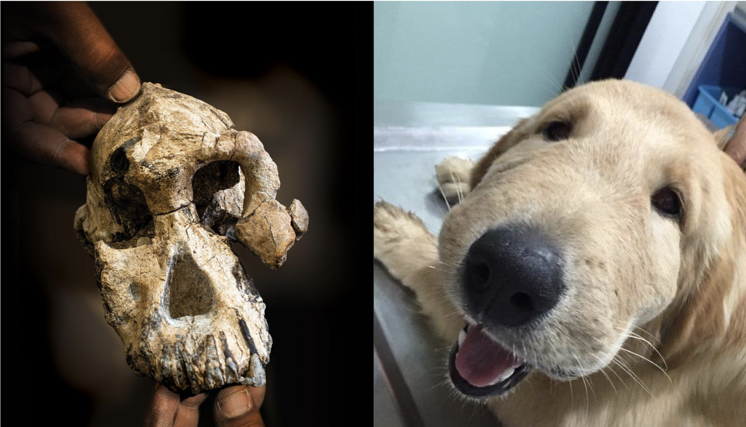
It’s Friday night. Our description of the Homo naledi femora (thigh bones) from the Lesedi Chamber is hot off the press. This coincides with the publication of another study (with which I wasn’t involved) of the species’ proximal femur, so I guess you could say it’s a pretty hip time for Homo naledi fossils.

screenshot_116

An important task in our study was to estimate the diameter of the poorly preserved femur head (part of the hip joint), a variable which is useful for estimating body mass in extinct animals, which in turn is an important life history variable. One thing I’ve recently been griping about with my students is that while many general research methods are well published, the step-by-step processes usually are not. So, here I’ll detail exactly how we estimated femur head diameter (FHD) —it’s pretty simple, but it took a while to figure it out on my own. And now you won’t have to!

We used the simple yet brilliant approach that Ashley Hammond and colleagues (2013) developed for the acetabulum (the hip socket). In brief, if you have a 3D model or mesh of a bone, you can use various software packages to highlight an area and the software will find the best fit of a given shape to that surface. I used Amira/Avizo and Geomagic Design X, which are great but admittedly quite expensive.

1. Identify the preserved bony surface by making a curvature map
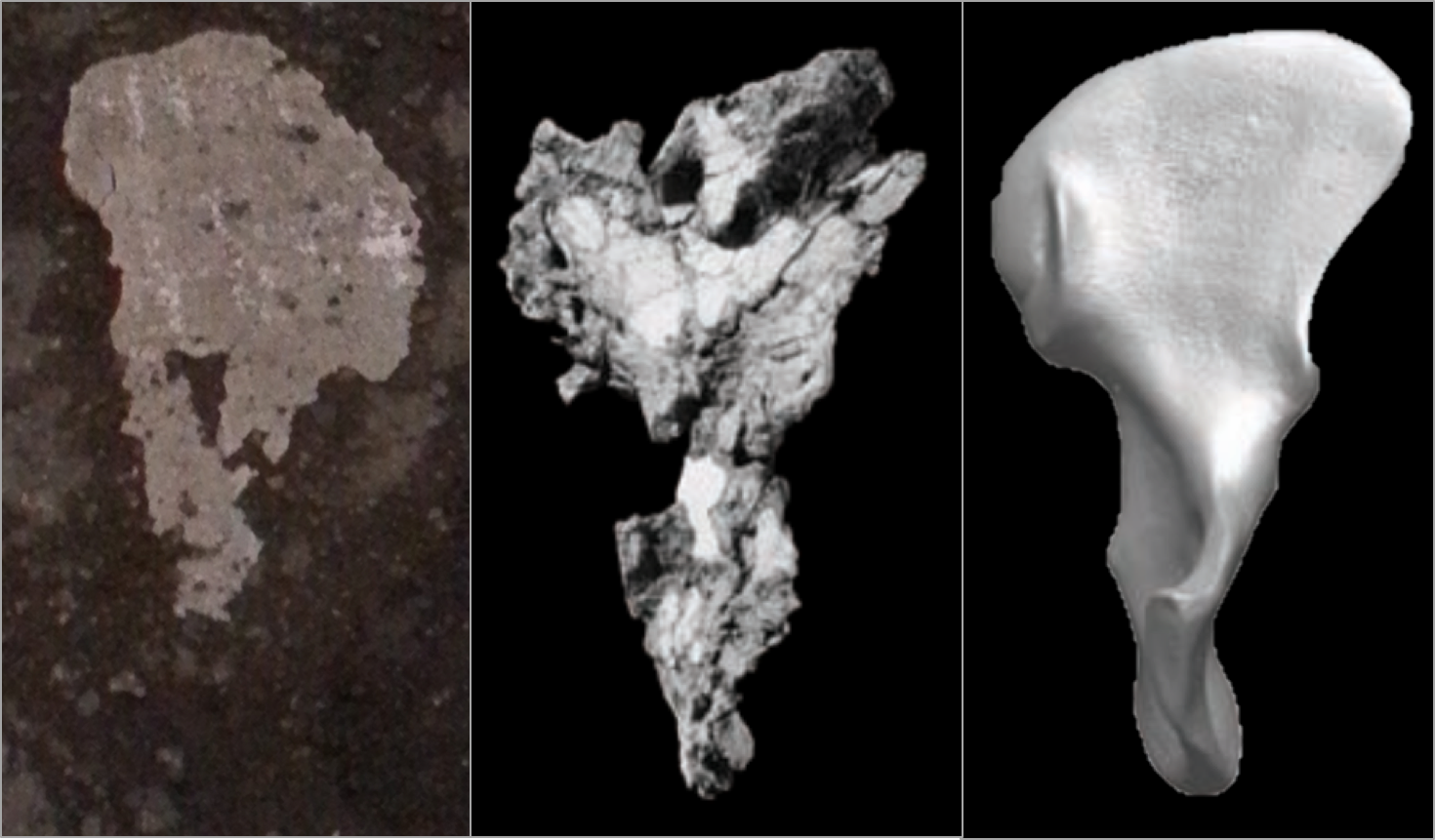
You can do this in Geomagic, but I figured it out in Amira first, so here we are. Also,  Amira gives you more control over the resulting colormap, which I think makes it easier to identify preserved vs. broken bone surfaces. The module-based workflow of Amira/Avizo takes some getting used to, but this step is quite simple, once you’ve imported the mesh (“UW 102a-001.stl” in the image below).

step 1

Amira workflow (left). The red “Curvature” module is applied to the surface mesh (“UW102a-001.stl”), resulting in a new object (“MaxCurvatureInv”), whose surface view is depicted at right.

The surface is now color-coded, with areas of high curvature (i.e., broken bone and exposed trabecular bone) in blue and better-preserved surfaces in red. This allows you to see which portion(s) of the bone to use to define the sphere.

Screen Shot 2019-06-26 at 10.55.28 AM

The curvature map reveals three large patches (A-C) of decently-preserved hip joint surface.

2. Highlight the desired surface in Geomagic
Import the 3D mesh into Geomagic, and use the “Lasso selection mode” to highlight the area (or areas) you wish to fit a sphere to. Make sure that you’ve toggled “Visible only,” so that you don’t accidentally highlight other parts of the bone. You can select a single area, or many areas. In the following example, I’ve highlighted only the large patch (“A” in the previous figure).

Screen Shot 2019-06-26 at 11.25.59 AM

3. Go all Brexit on the highlighted region
That is, declare it as its own distinct region. Navigate to the “Region” tab and click the “Insert” icon. Magically, the highlighted region is now outlined and a shaded in a new color, and listed as “Region group 1” in the window on the left.

Picture1

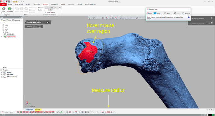
4. Measure the region’s radius
Select the “Measure Radius” icon at the bottom of the window, and then when you scroll or hover the mouse over the region, the radius will appear within the patch. The value should be the same throughout the region which is now treated as a spherical surface.

Screen Shot 2019-06-26 at 12.19.36 PM

5. Visualize the fitted sphere
If your main goal is to obtain estimates of diameters, you can stop here (don’t forget that the diameter is radius x 2!). But it can be handy to know how the proximal femur would look with the complete head (not that these are perfectly spherical…). To do this, navigate to the “Model” tab and select the “Surface primitive” icon. In the grey menus that appear on the left, select the region and “Sphere” as the shape to be extracted.

Picture1

Three orthogonal circumferences will appear around the highlighted area, and if they look OK, click the right-pointing arrow at the top of the menus, and there you go!

Picture1

Wowzers.

I did this a few times on the Homo naledi femur from Lesedi, and got measurements within about 1-2 mm of one another, which is good. What’s more, we used this method on a sample of modern human and fossil hominin femur heads for which the actual diameters were known, to demonstrate the accuracy of the method.

Lesedi sphere vs FHD_No Krapina copy

Femur head diameter measured directly (y-axis) vs. sphere-based estimates using the method described here (x-axis). The Homo naledi estimate is indicated by the blue line.

This graph shows that the sphere-based estimates very closely approximate direct measurements, although there is some slight overestimation at larger sizes, i.e. not affecting the H. naledi value. So although the fossil is not perfectly preserved, we are fairly confident in our estimate of its femur head diameter.

Worst year in review

As we’re wrapping up what may be the worst year in recent global memory, especially geopolitically, let’s take a moment to review some more positive things that came up at Lawnchair in 2016.

Headed home

IMG_20160801_143520

Alternate subtitle: Go West
This was a quiet year on the blog, with only 18 posts compared with the roughly thirty per year in 2014-2015. The major reason for the silence was that I moved from Kazakhstan back to the US to join the Anthropology Department at Vassar College in New York. With all the movement there was  less time to blog. Much of the second half of 2016 was spent setting up the Biological Anthropology Lab at Vassar, which will focus on “virtual” anthropology, including 3D surface scanning…

20161111_141908.jpg

Cast of early Homo cranium KNM-ER 1470 and 3D surface scan made in the lab using an Artec Spider.

… and 3D printing.

20161107_135616

gibbon endocast, created from a CT scan using Avizo software and printed on a Zortrax M200.

This first semester stateside I reworked my ‘Intro to Bio Anthro’ and ‘Race’ courses, which I think went pretty well being presented to an American audience for the first time. The latter class examines human biological variation, situating empirical observations in modern and historical social contexts. This is an especially important class today as 2016 saw a rise in nationalist and racist movements across the globe. Just yesterday Sarah Zhang published an essay in The Atlantic titled, “Will the Alt-right peddle a new kind of racist genetics?” It’s a great read, and I’m pleased to say that in the Race class this semester, we addressed all of the various social and scientific issues that came up in that piece. Admittedly though, I’m dismayed that this scary question has to be raised at this point in time, but it’s important for scholars to address and publicize given our society’s tragically short and selective memory.

So the first semester went well, and next semester I’ll be teaching a seminar focused on Homo naledi and a mid-level course on the prehistory of Central Asia. The Homo naledi class will be lots of fun, as we’ll used 3D printouts of H. naledi and other hominin species to address questions in human evolution. The Central Asia class will be good prep for when I return to Kazakhstan next summer to continue the hunt for human fossils in the country.

Osteology is still everywhere

A recurring segment over the years has been “Osteology Everywhere,” in which I recount how something I’ve seen out and about reminds me of a certain bone or fossil. Five of the blog 18 posts this year were OAs, and four of these were fossiliferous: I saw …

2016-02-09 16.26.31

Anatomy terminology hidden in 3D block letters,

Picture1

Hominin canines in Kazakhstani baursaki cakes,

Picture1

The Ardipithecus ramidus ilium in Almaty,

screen-shot-2016-11-26-at-5-36-05-pm

Homo naledi juvenile femur head in nutmeg,

bangkok-erectus

And a Homo erectus cranium on a Bangkok sidewalk. As I’m teaching a fossil-focused seminar next semester, OA will probably become increasingly about fossils, and I’ll probably get my students involved in the fun as well.

New discoveries and enduring questions

The most-read post on the blog this year was about the recovery of the oldest human Nuclear DNA, from the 450,000 year old Sima de los Huesos fossils. My 2013 prediction that nuclear DNA would conflict with mtDNA by showing these hominins to be closer to Neandertals than Denisovans was shown to be correct.

giphy

These results are significant in part because they demonstrate one way that new insights can be gained from fossils that have been known for years. But more intriguingly, the ability of researchers to extract DNA from exceedingly old fossils suggests that this is only the tip of the iceberg.

The other major discoveries I covered this year were the capuchin monkeys who made stone tools and the possibility that living humans and extinct Neandertals share a common pattern of brain development.

Pride & Predator

An unrelated image from 2016 that makes me laugh.

The comparison between monkey-made and anthropogenic stone tools drives home the now dated fact that humans aren’t the only rock-modifiers. But the significance for the evolution of human tool use is less clear cut – what are the parallels (if any) in the motivation and modification of rocks between hominins and capuchins, who haven’t shared a common ancestor for tens of millions of years? I’m sure we’ll hear more on that in the coming years.

In the case of whether Neandertal brain development is like that of humans, I pointed out that new study’s results differ from previous research probably because of differences samples and methods. The only way to reconcile this issue is for the two teams of researchers, one based in Zurich and the other in Leipzig, to come together or for a third party to try their hand at the analysis. Maybe we’ll see this in 2017, maybe not.

There were other cool things in 2016 that I just didn’t get around to writing about, such as the publication of new Laetoli footprints with accompanying free 3D scans, new papers on Homo naledi that are in press in the Journal of Human Evolution, and new analysis of old Lucy (Australopithecus afarensis) fossils suggesting that she spent a lifetime climbing trees but may have sucked at it. But here’s hoping that 2017 tops 2016, on the blog, in the fossil record, and basically on Earth in general.